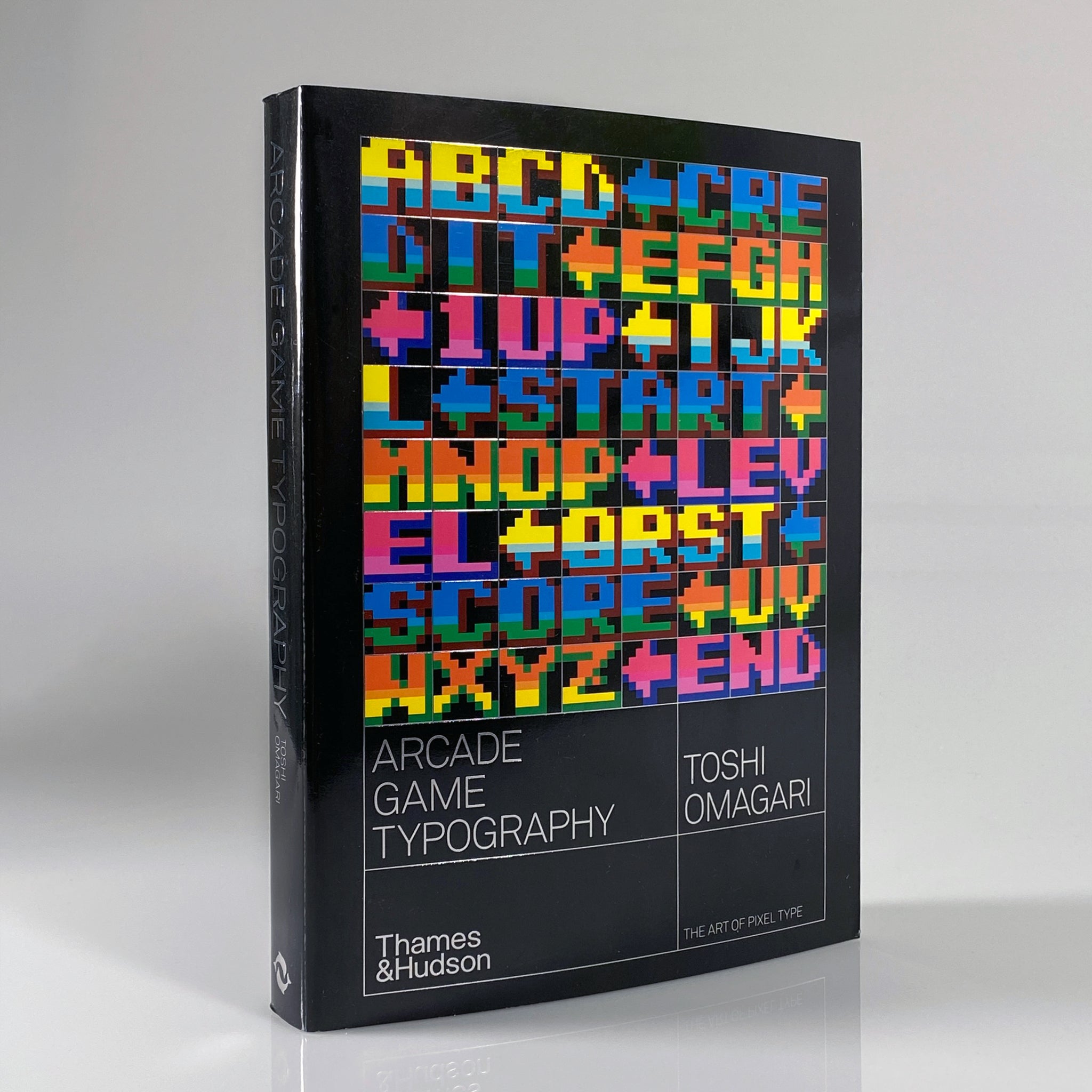
A definitive survey of ’70s, ’80s, and early ’90s arcade video game pixel typography. By Toshi Omagari, with a foreword Kiyonori Muroga Arcade Game Typography presents readers with a fascinating new world of typography: the pixel typeface. Video game designers of the ’70s, ’80s, and ’90s faced color and resolution limitations that stimulated incredible creativity. With each letter having to exist in a small pixel grid, artists began to use clever techniques to create elegant character sets within a tiny canvas. This book presents typefaces on a dynamic and decorative grid, taking reference from high-end type specimens while adding a suitably playful twist. Featuring pixel typefaces carefully selected from the first decades of arcade video games, Arcade Game Typography presents a completist survey of a previously undocumented outsider typography movement, accompanied by insightful commentary from author Toshi Omagari, a typeface designer at Monotype. Gathering an eclectic range of typography, from hit games such as Super Sprint , Marble Madness , and Space Harrier to countless lesser-known gems, Arcade Game Typography is a vivid nostalgia trip for gamers, designers, typographers, and illustrators alike. "A definitive guide to 70s, 80s and early 90s arcade game pixel typography." — HypeBeast Designed by Leo Field Published by Thames & Hudson, 2019 Softcover, 272 pages, 300 color images, 6.8 × 9.1 inches ISBN: 978-0-50-002174-3







Community Notes