Forever Everett
by Nolan Paparelli
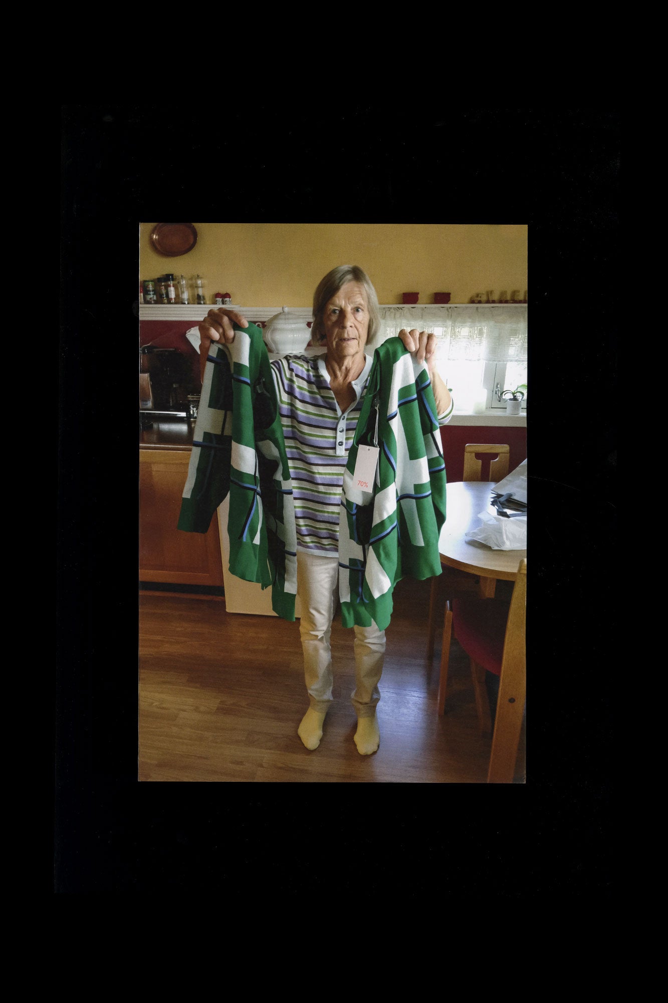
Forever Everett is an hybrid publication celebrating simultaneously Daniel Everett’s photographic work and the eponymous typeface designed by Nolan Paparelli. The publication is composed of a series of 6 double-sided posters, folded twice, which becomes a large booklet when combined together, always alternating between photo- and typographic details. While both medium react to each other at an equal level as a spread, being zoomed in and fostering interesting close-up, each sheet can then be taken out and used as a single poster. This hybrid form also echoes the versatility of the typeface, showing its interesting balance between a display and text typeface. Each type poster highlights quotes from the photographer himself with different weights and sizes, showing the full spectrum of the Everett font family. Published by: WELTKERN® Content: 24 pages Size Publication: 240 × 340 mm Poster: 480 x 680 mm Weight 0.195 kg Design: Nolan Paparelli Photographs by: Daniel Everett Language: English Publishing date: 21 03 2022 Printed by: Offizin Scheufele, Germany Specs: Softcover (no binding) 3x photo posters, double-sided, folded twice 3x type posters, double-sided, folded twice Paper: Okastar 100g/m2 (coated) Munken 100g/m2 (uncoated) Print run: 500 ex. Images © WELTKERN® / Nolan Paparelli All rights reserved.
Subjects
Booksdaniel everettPhotographypostertypetype designweltkernzine
- Have:1
- Want:—
- Avg Rating:—
- Ratings:—
Recommendations
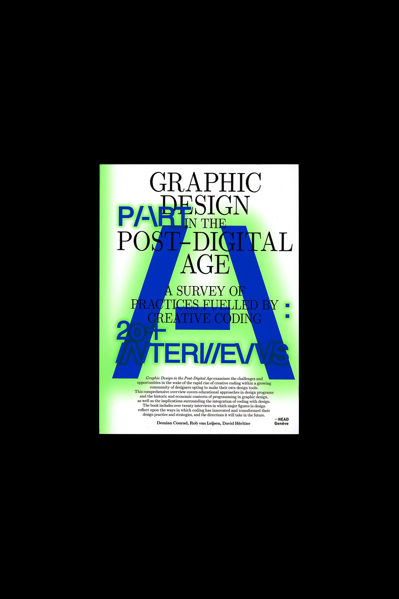
Graphic Design in the Post-Digital Age
by Creative Coding Introduction by Demian Conrad
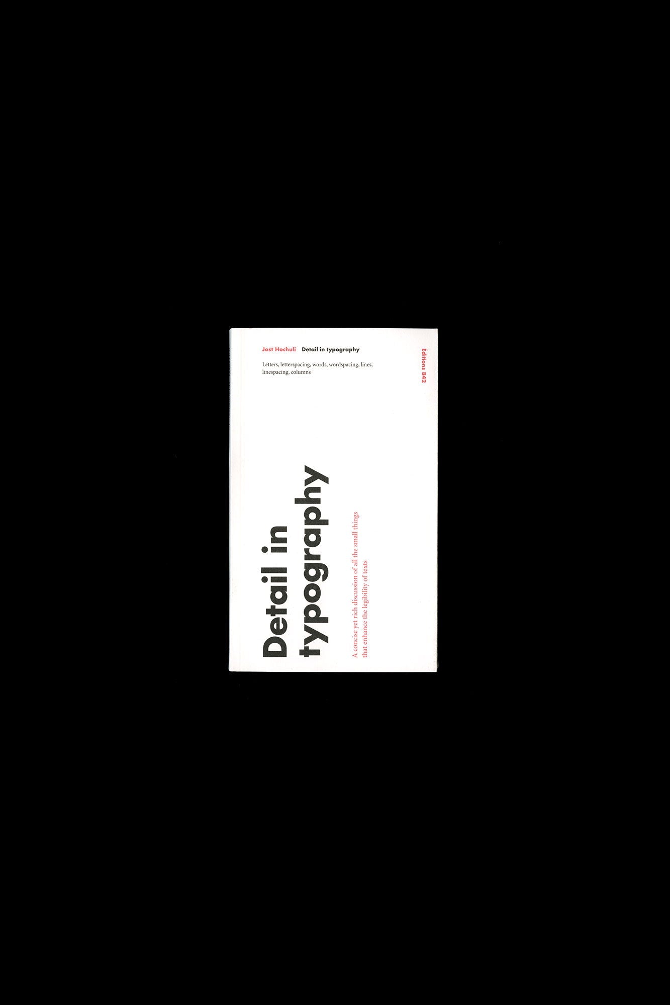
Detail in Typography
by Anonymous
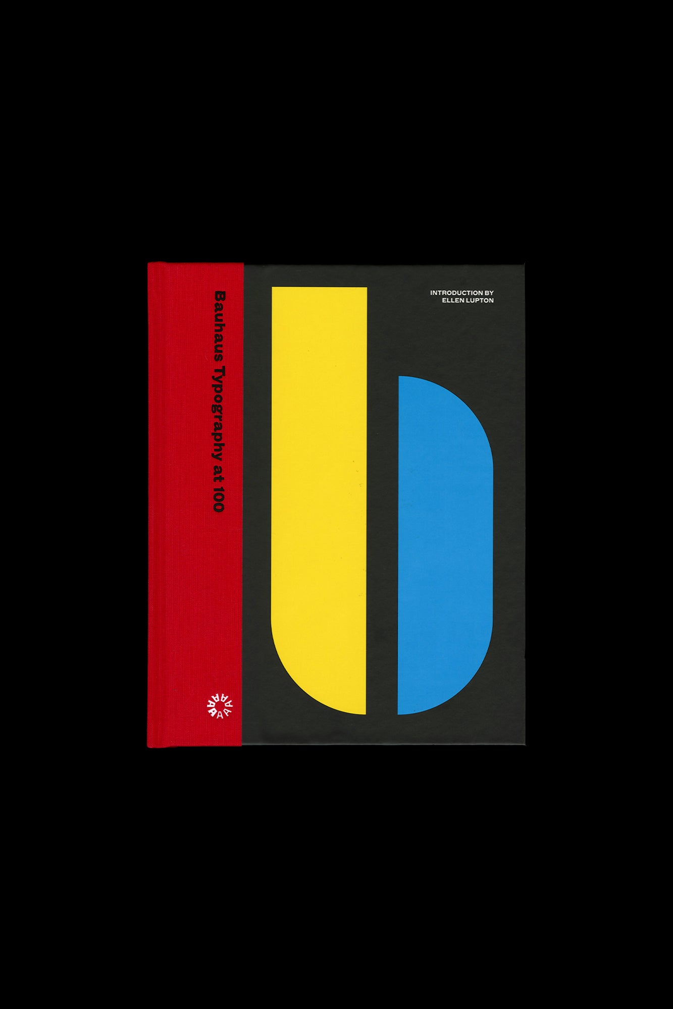
Bauhaus Typography at 100
by Bauhaus Typography at
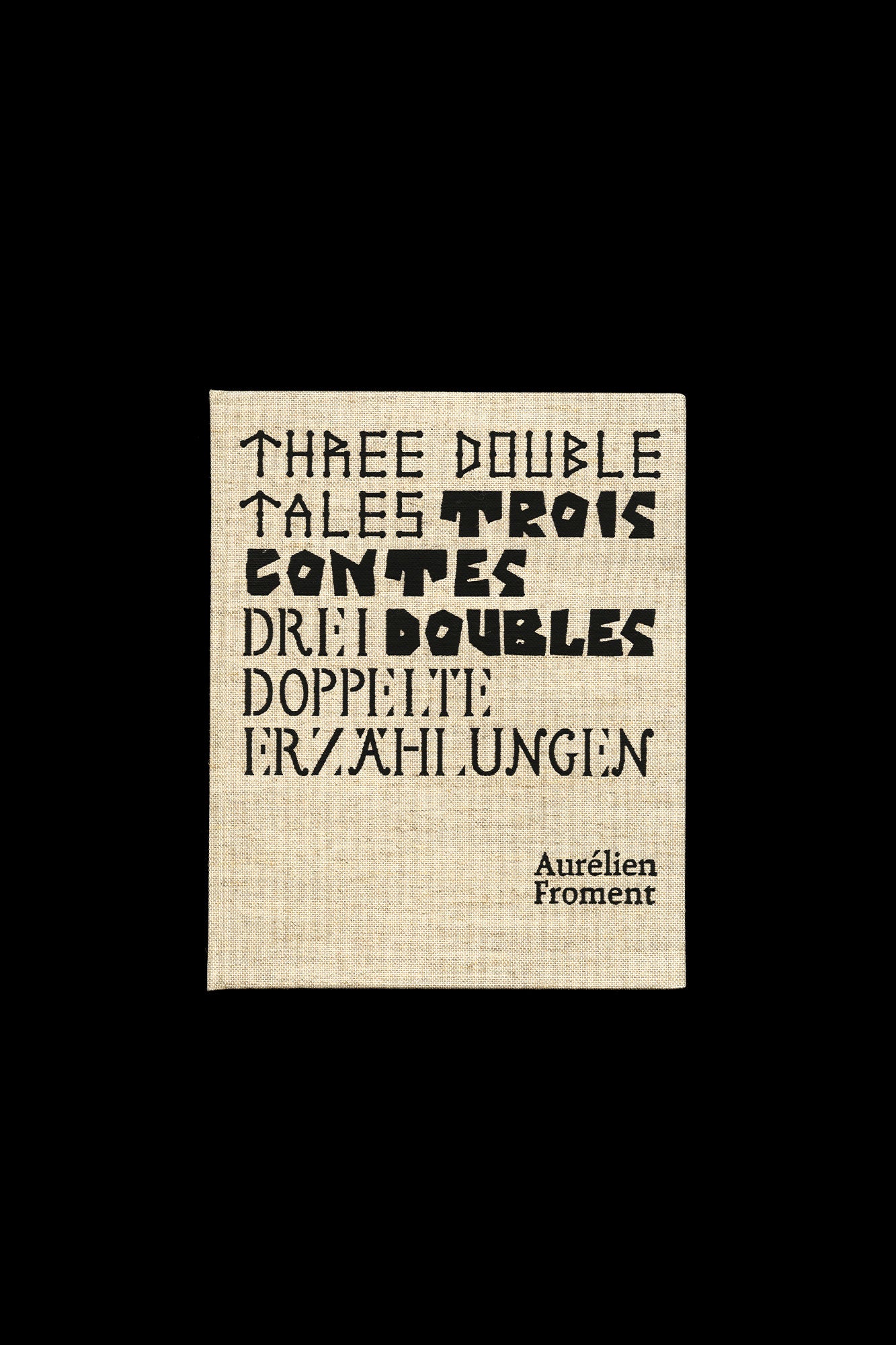
Aurélien Froment: Three Double Tales
by Froment
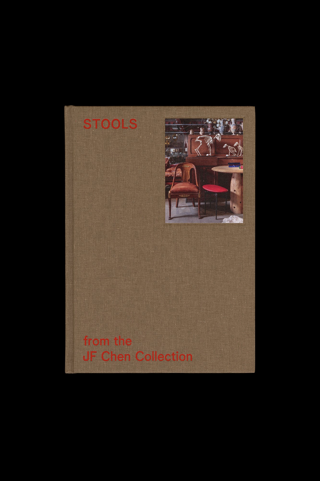
STOOLS from the JF Chen Collection
by Dung Ngo; Photographs by Brian Guido
Felix Salut: Shut Up I’m Counting!
by an oracle that gives enigmatic directions and distracted by a point that keeps devising new obstacles
New Deal
by two essays from architect Wendy Gilmartin
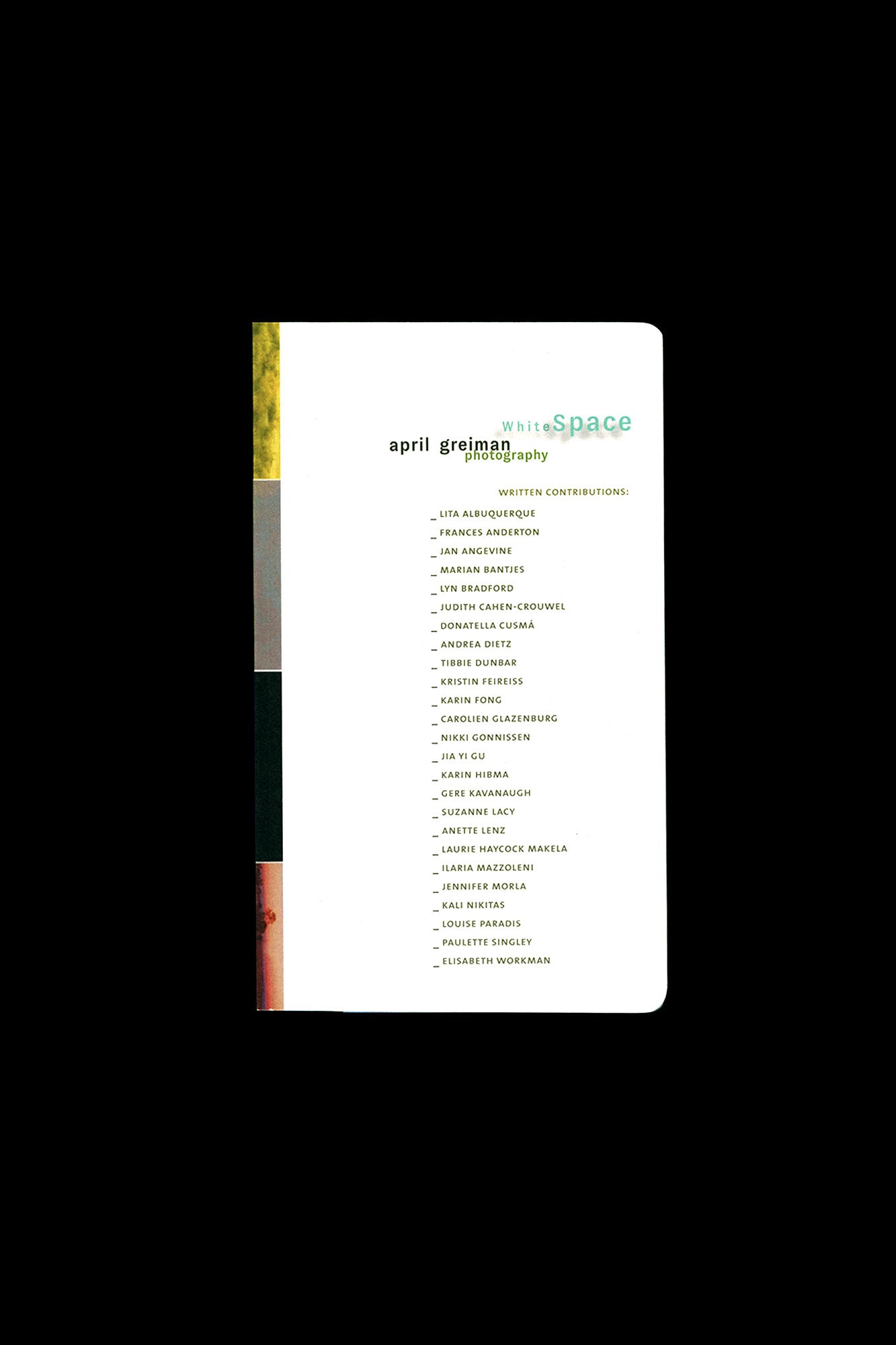
WhiteSpace
by curious digital icons and vertical typographic texts
Ruth van Beek: The Oldest Thing
by Van Beek’s long-time friend Basje Boer add nuance to the material
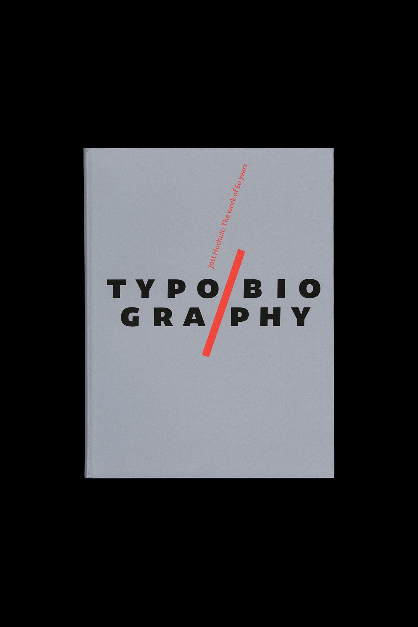
Jost Hochuli: Typobiography
by Hochuli himself
William Eggleston’s Guide
by a shiny silver tricycle
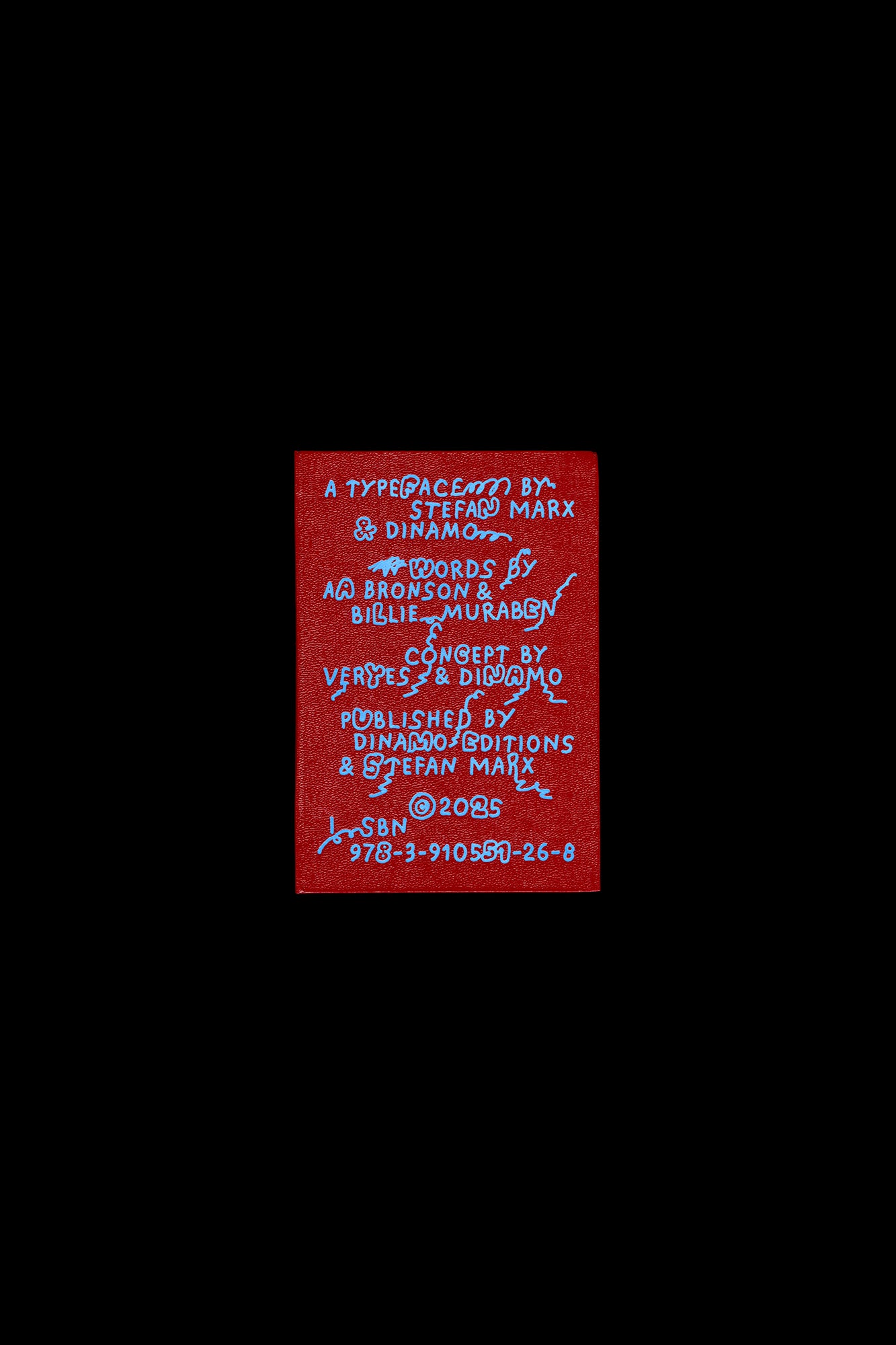
ABC Stefan by Stefan Marx
by Dinamo and veryes
L’Isola
by UNESCO in 2010 for the Atlas of the World’s Languages in Danger
OCR-X Type Specimen
by Maxitype
Lettering: The Handbook for Lettering by Walter Käch
by tracing: Käch taught designers how to look for elements in the construction of letters that could be modified and built u
Aglaia Konrad: Japan Works
by postscript glosses written by architect and critic Julian Worrall
Levi Jackson:Pleasure Grounds
by Utah-based photographer Levi Jackson
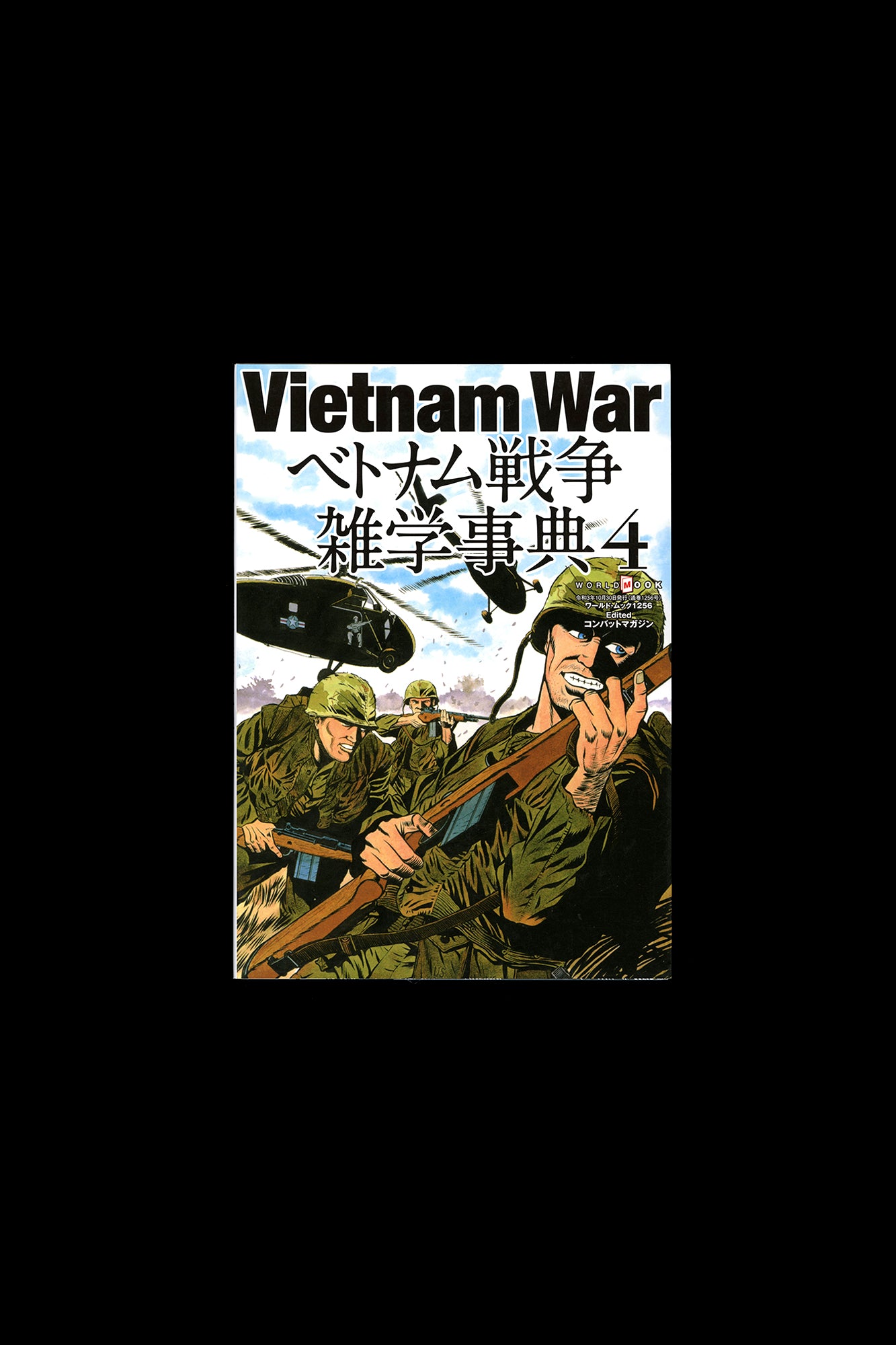
Vietnam War 4
by Vietnam War
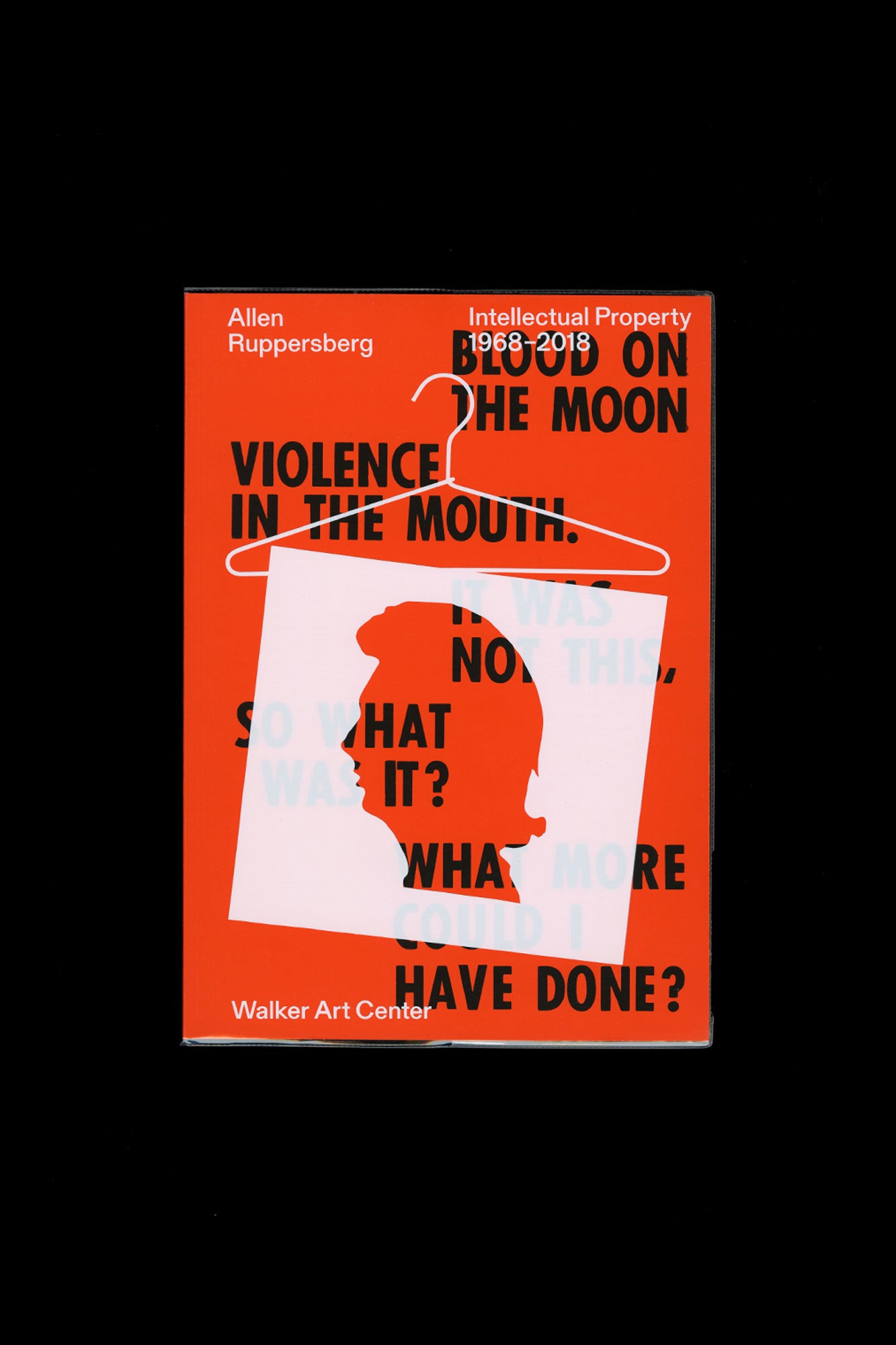
Allen Ruppersberg: Intellectual Property 1968–2018
by the Walker’s award-winning design studio and in close collaboration with the artist
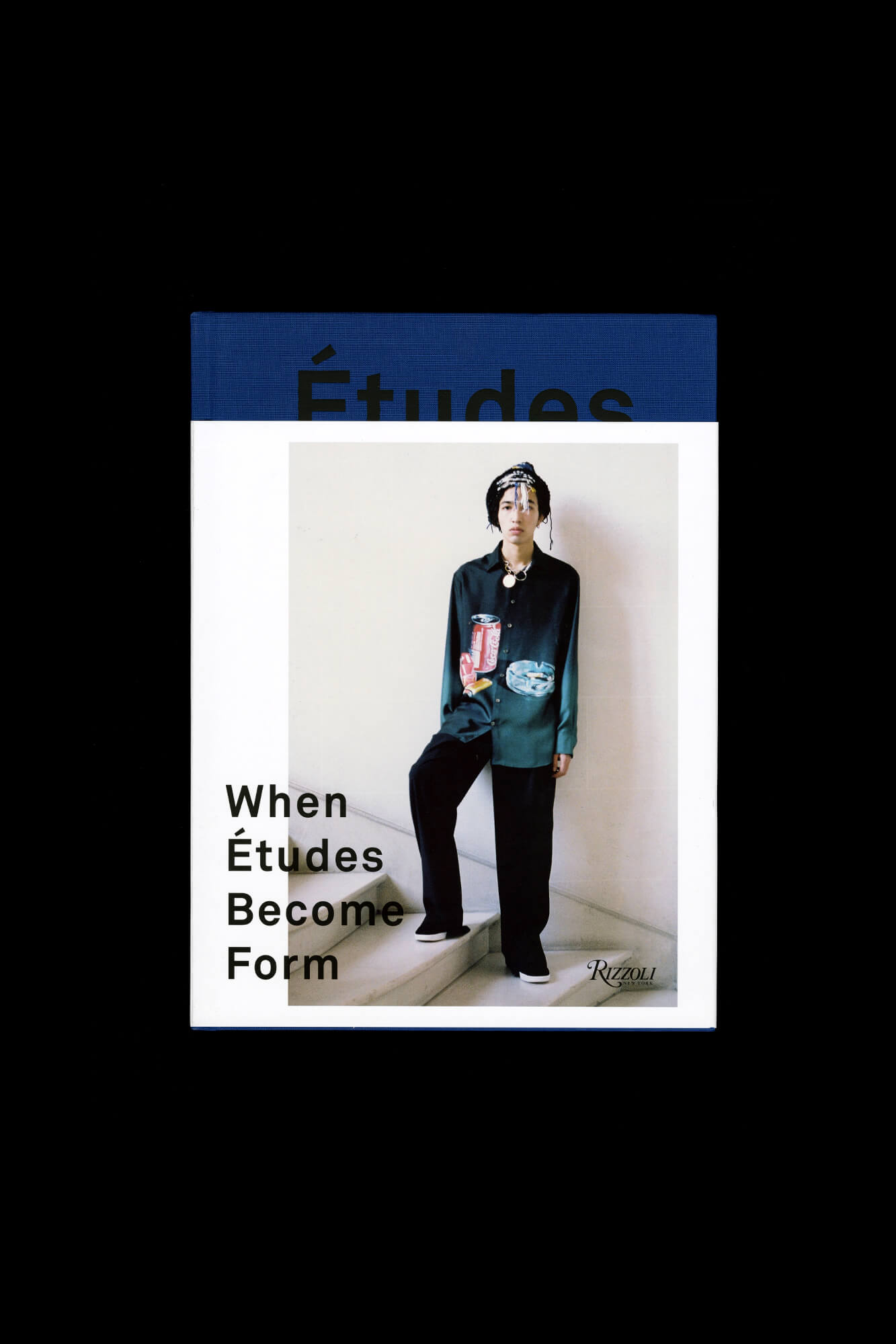
When Études Become Form
by Rizzoli Edited and designed by Études Studio Published by Rizzoli International Publications
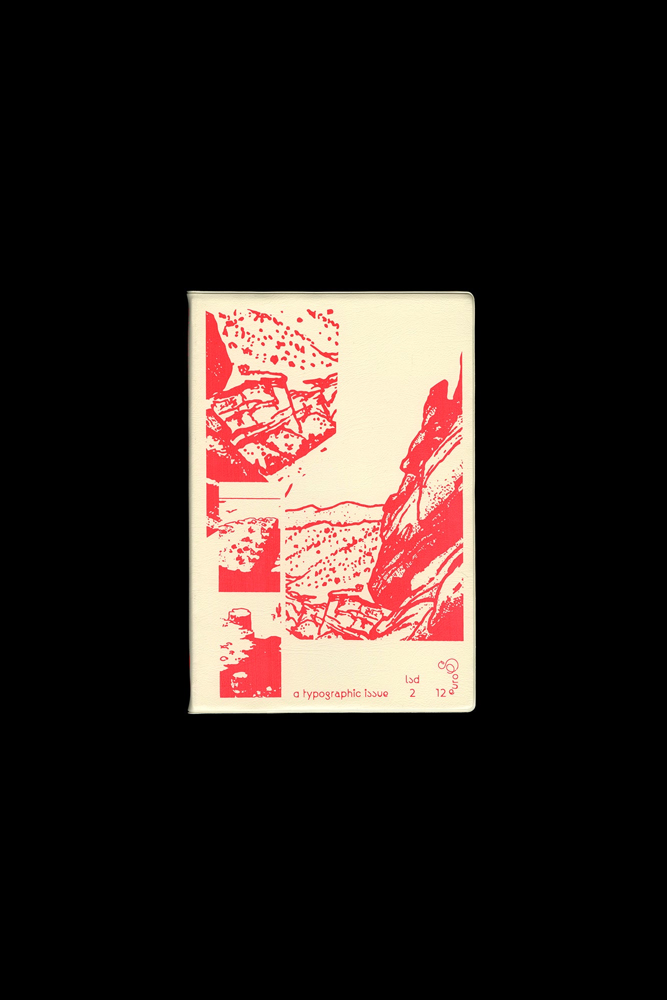
LSD 02: A Typographic Issue
by Catherine Guiral ("Ultra Letters: Moments of Visual Bravura from Hains to Faucheux"); a study of "free" fonts by Frank Ad
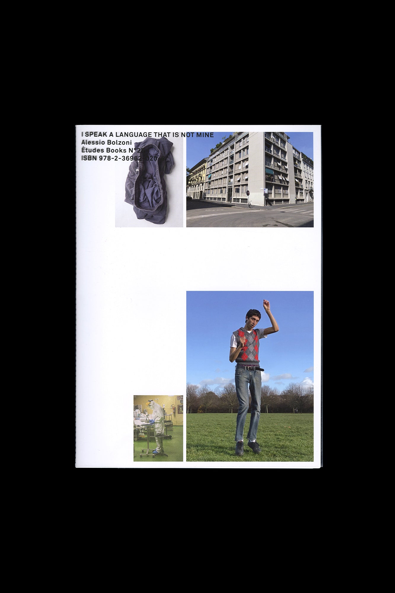
I Speak A Language That Is Not Mine
by Alessio Bolzoni Edited and designed by Études Studio Published by Études Books
Sharp Type Volume One
by Sharp Type
Max Kersting: Planet der Anfänger
by the author of the popular gift book bestseller “Drei unbeschwerte Tage” and the award-winning calendar triology Max Kerst
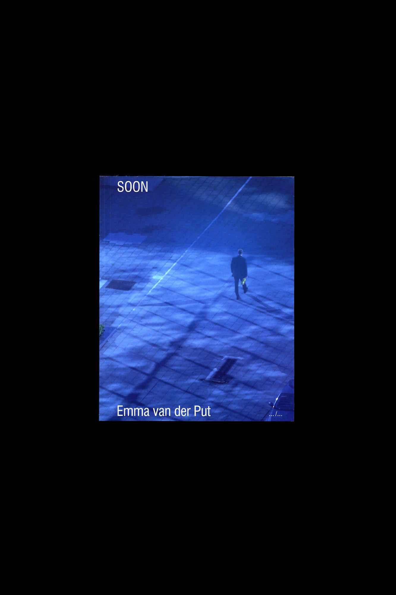
Emma van der Put-Soon
by means of a dialogue between the text and the visual material from the videos
Goldwin 0: Enquiry #1, #2, #3
by
David Rothenberg: Roosevelt Station
by crisis and division
Pyramid Scheme
by the generals of antiquity when visiting a battlefield
Selecta Type Specimen
by Maxitype
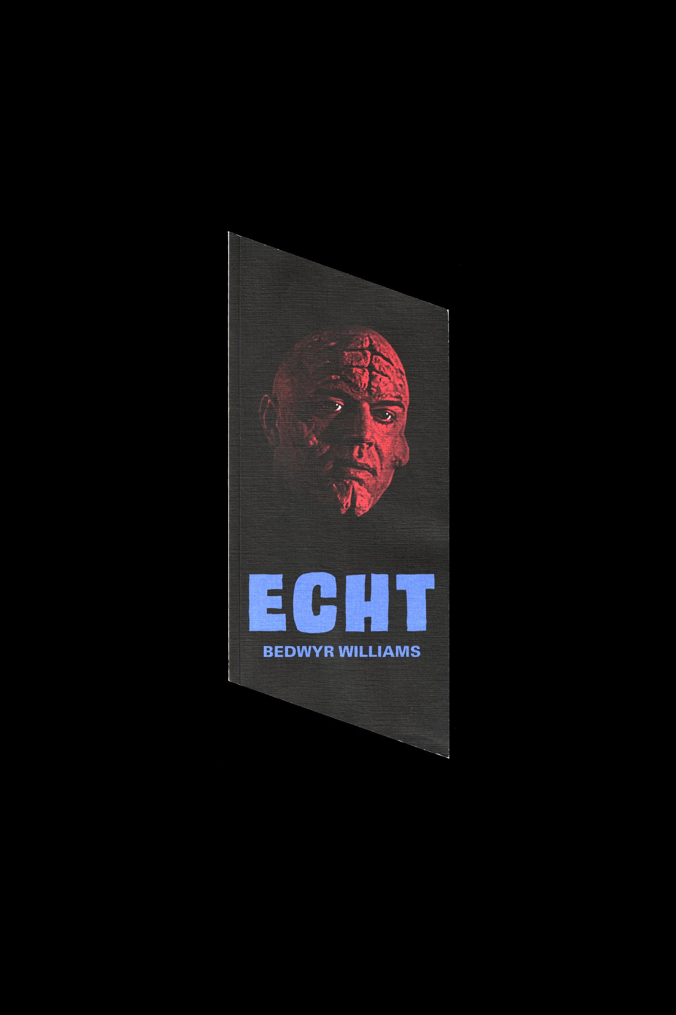
Bedwyr Williams: Echt/70°
by Tai Shani


Community Notes