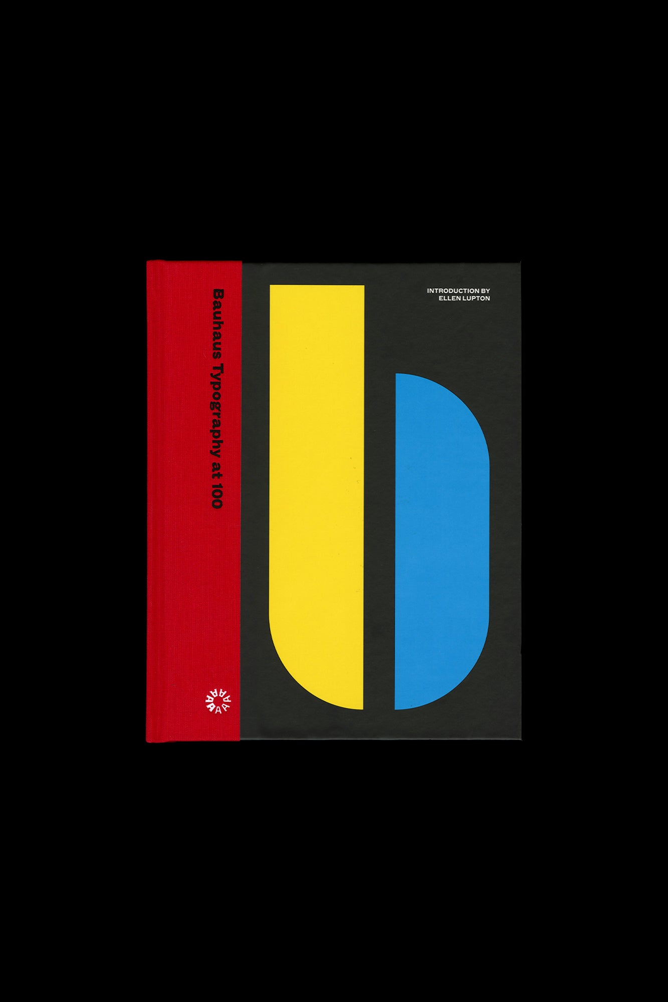
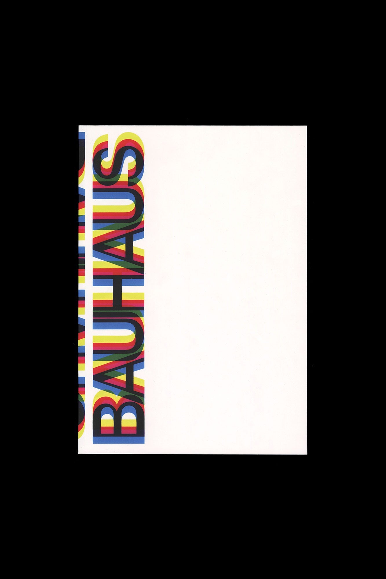
Bauhaus Typography at 100
by Bauhaus Typography at
An unprecedented look at the school’s typography and print design, from its early expressive tendencies to the functional modernism for which it is famed today Known for its bold sans-serif typefaces, crisp asymmetrical grids and clean use of negative space, the Bauhaus emerged as the forebearer of a new look—one that seized the tools of mass production in the creation of a radical new art. Today, just over 100 years after the Bauhaus’s opening in 1919, the school’s visual hallmarks have come to define modernity as it appears on the printed page.
Publisher
Letterform Archive
Subjects
Books bauhaus Bauhaus Typography Bauhaus Typography at 100 letterform archive research type type design typeface typefacedesign
Have: 1 Want: — Avg Rating: — Ratings: —
Discovery
Your Copy
Market
Community
Recommendations
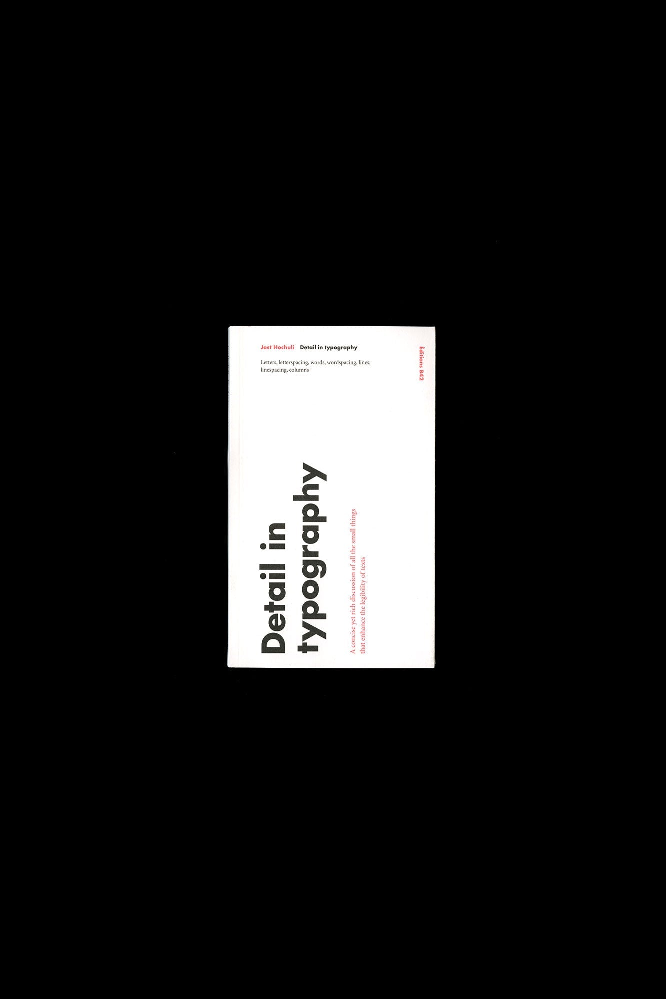
Detail in Typography
by Anonymous
Books books type type design
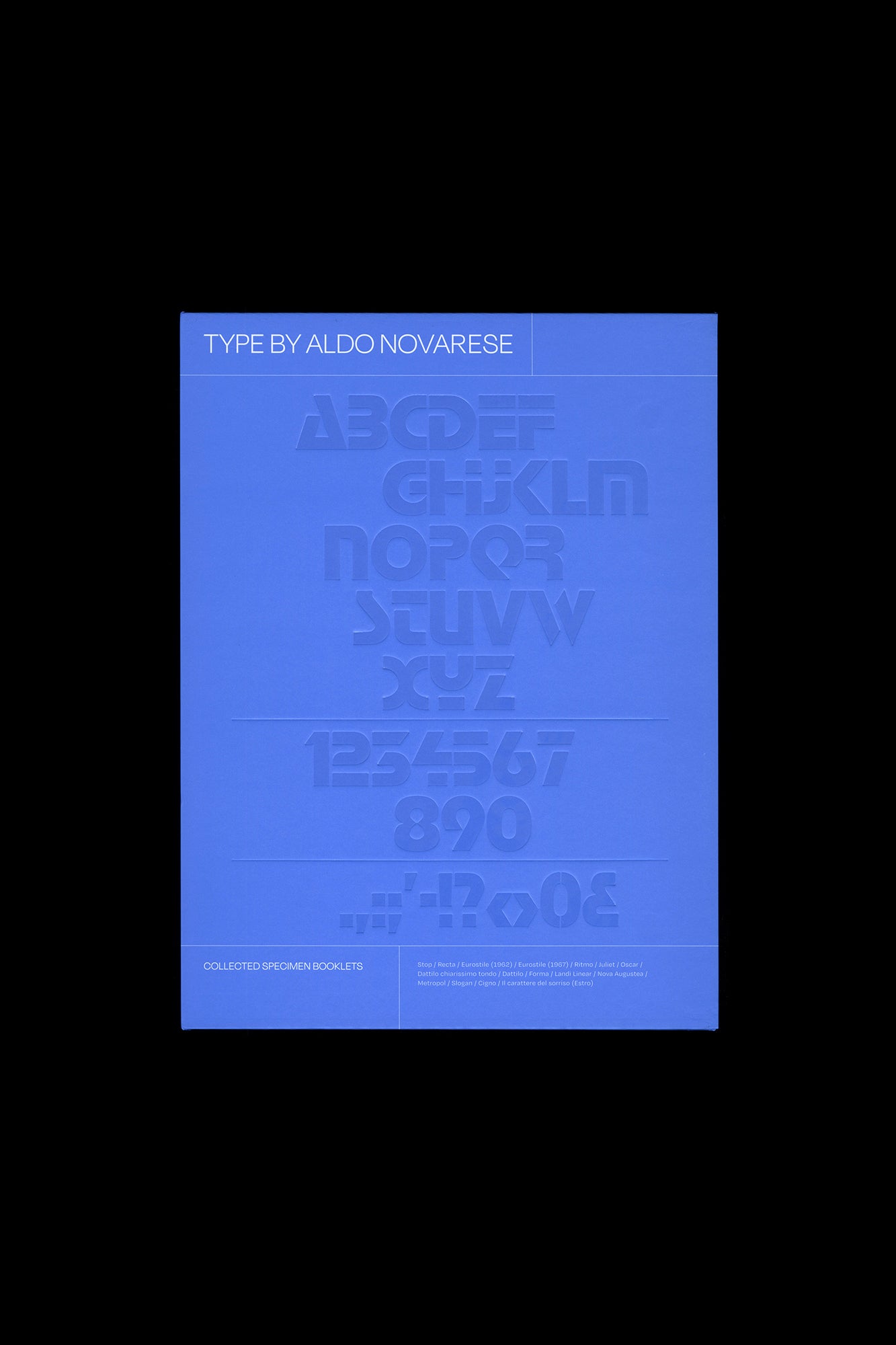
Type by Aldo Novarese: Collected Specimen Booklets
by quintessential Italian type designer Aldo Novarese
ISBN: 9781754937996 Books type type design typeface
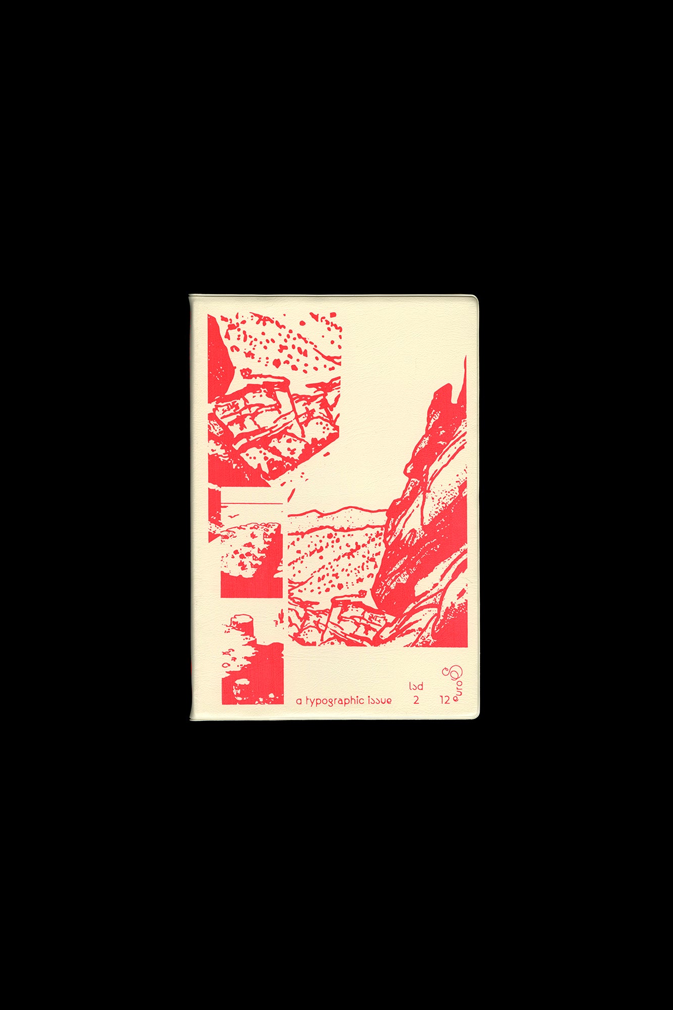
LSD 02: A Typographic Issue
by Catherine Guiral ("Ultra Letters: Moments of Visual Bravura from Hains to Faucheux"); a study of "free" fonts by Frank Ad
ISBN: 9782957204410 Books type type design typeface
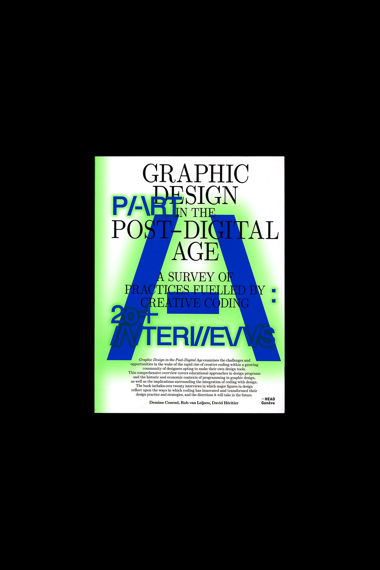
Graphic Design in the Post-Digital Age
by Creative Coding Introduction by Demian Conrad
ISBN: 9781697578447 Books books research type
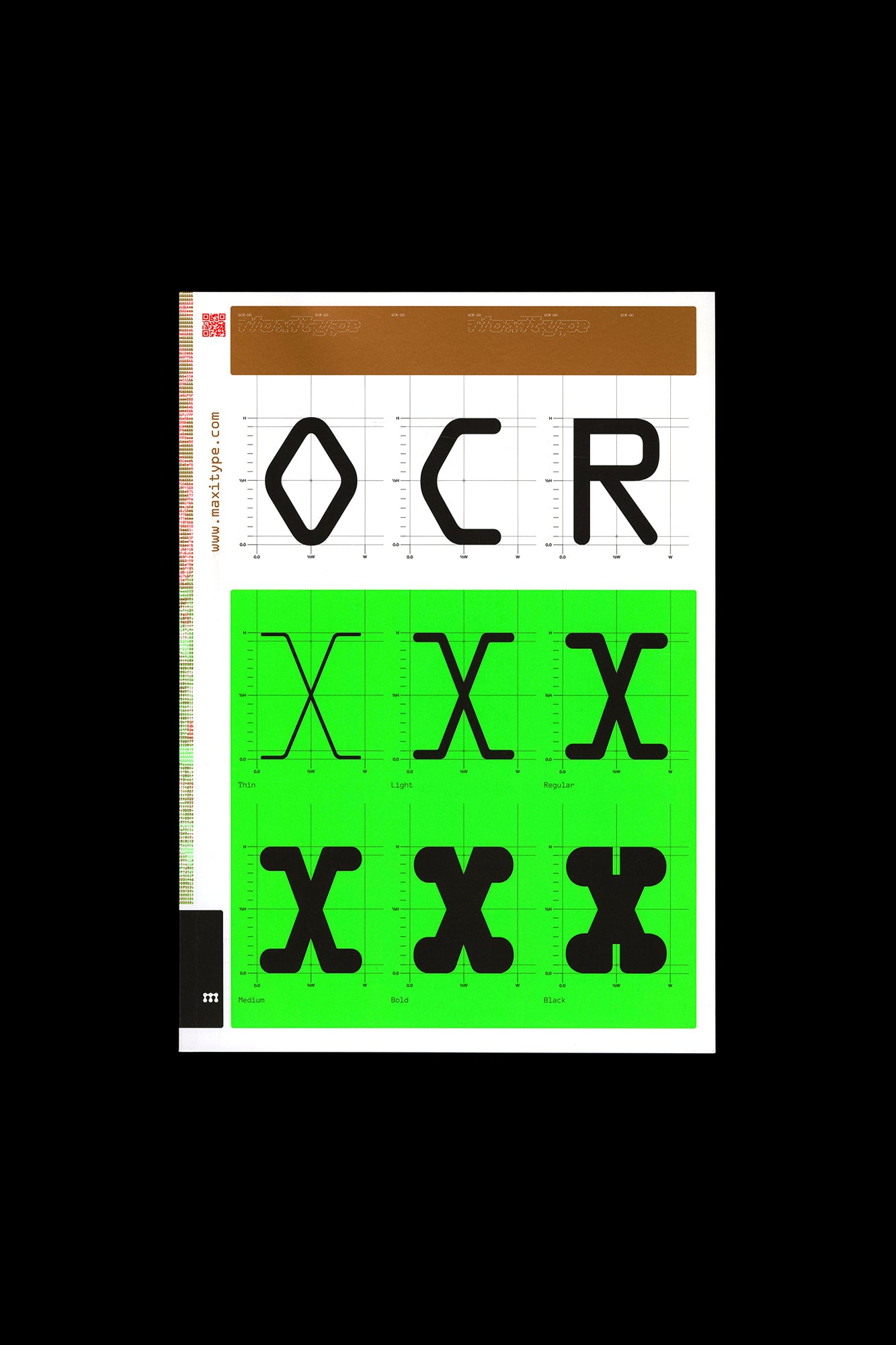
OCR-X Type Specimen
by Maxitype
ISBN: 9782970173007 Books type type design typeface
Sharp Type Volume One
by Sharp Type
ISBN: 9798990440500 Books type type design typeface
Lettering: The Handbook for Lettering by Walter Käch
by tracing: Käch taught designers how to look for elements in the construction of letters that could be modified and built u
ISBN: 9783910551046 Books type type design typeface
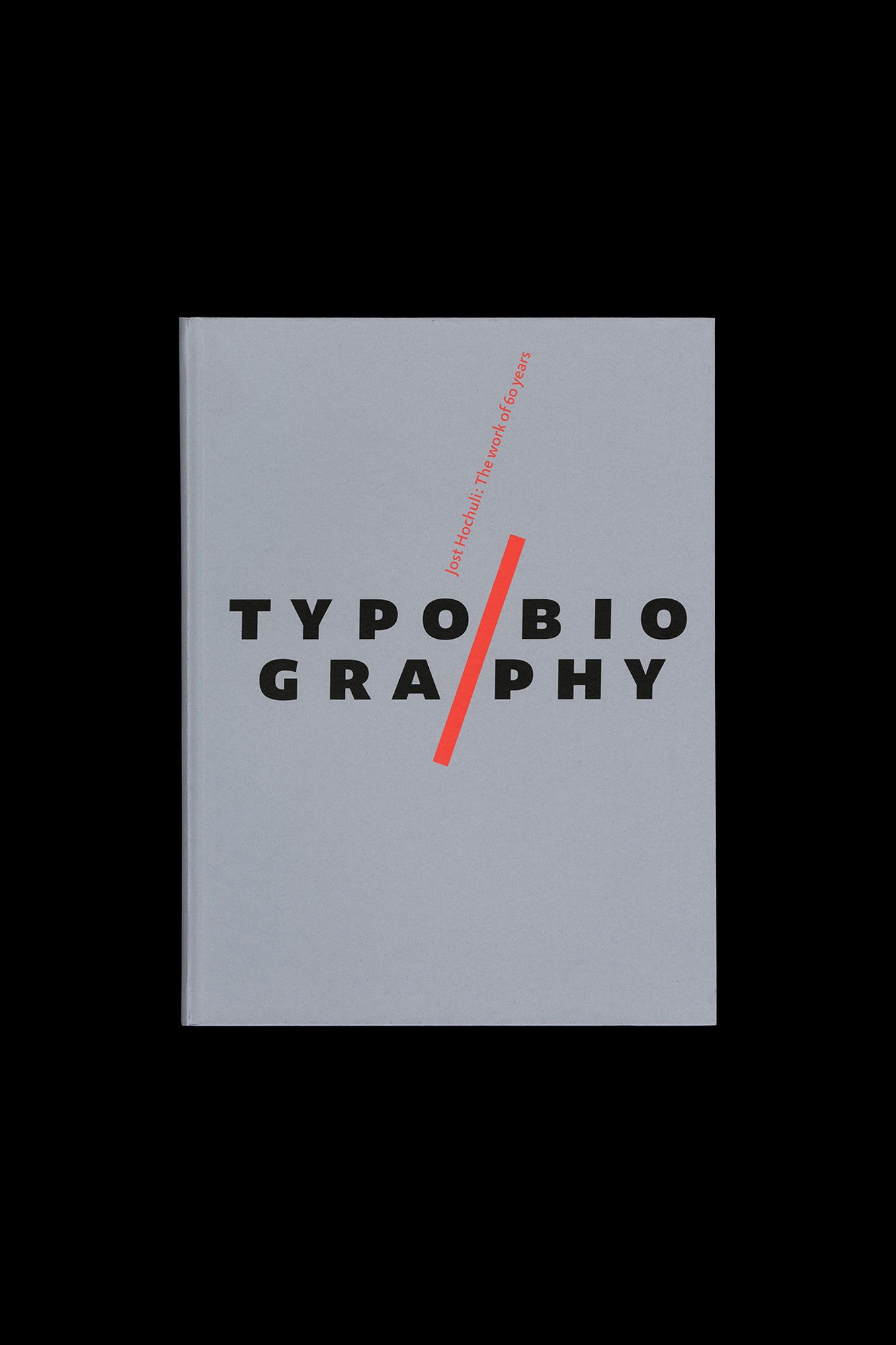
Jost Hochuli: Typobiography
by Hochuli himself
ISBN: 9781707257416 Books research type type design
Bauhaus: Weimar, Dessau, Berlin, Chicago
by Bauhaus
Books bauhaus books research
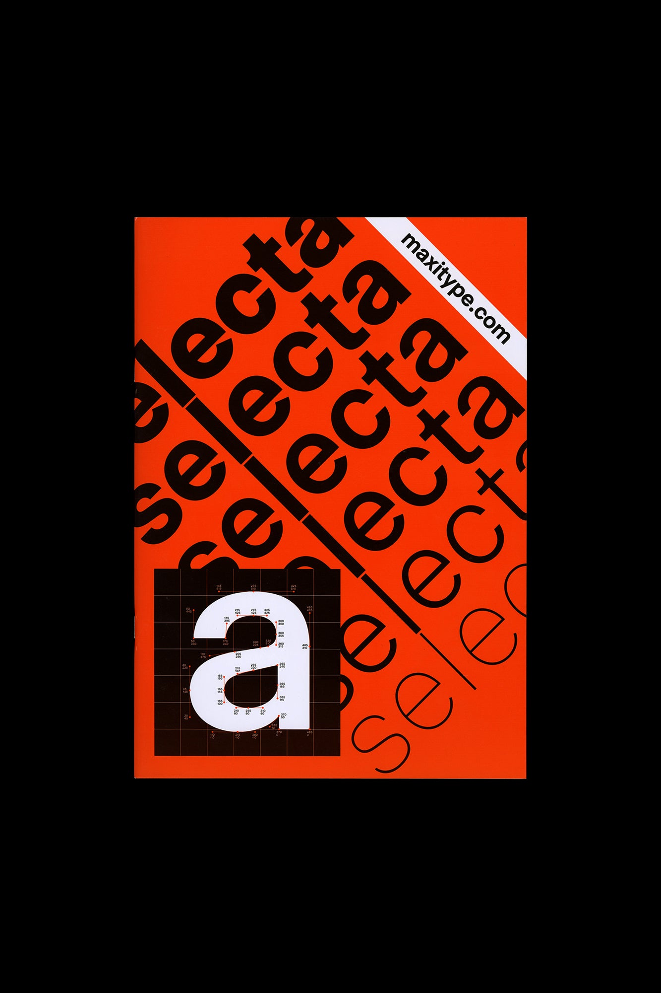
Selecta Type Specimen
by Maxitype
ISBN: 9781714593484 Books type type design
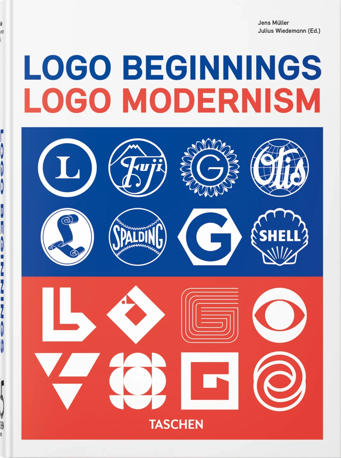
Logo Beginnings. Logo Modernism. 45th Ed.
by the evolution of modern corporate identities
ISBN: 9781757605847 Books type design typefacedesign
Vietnam War 4
by Vietnam War
Books books research
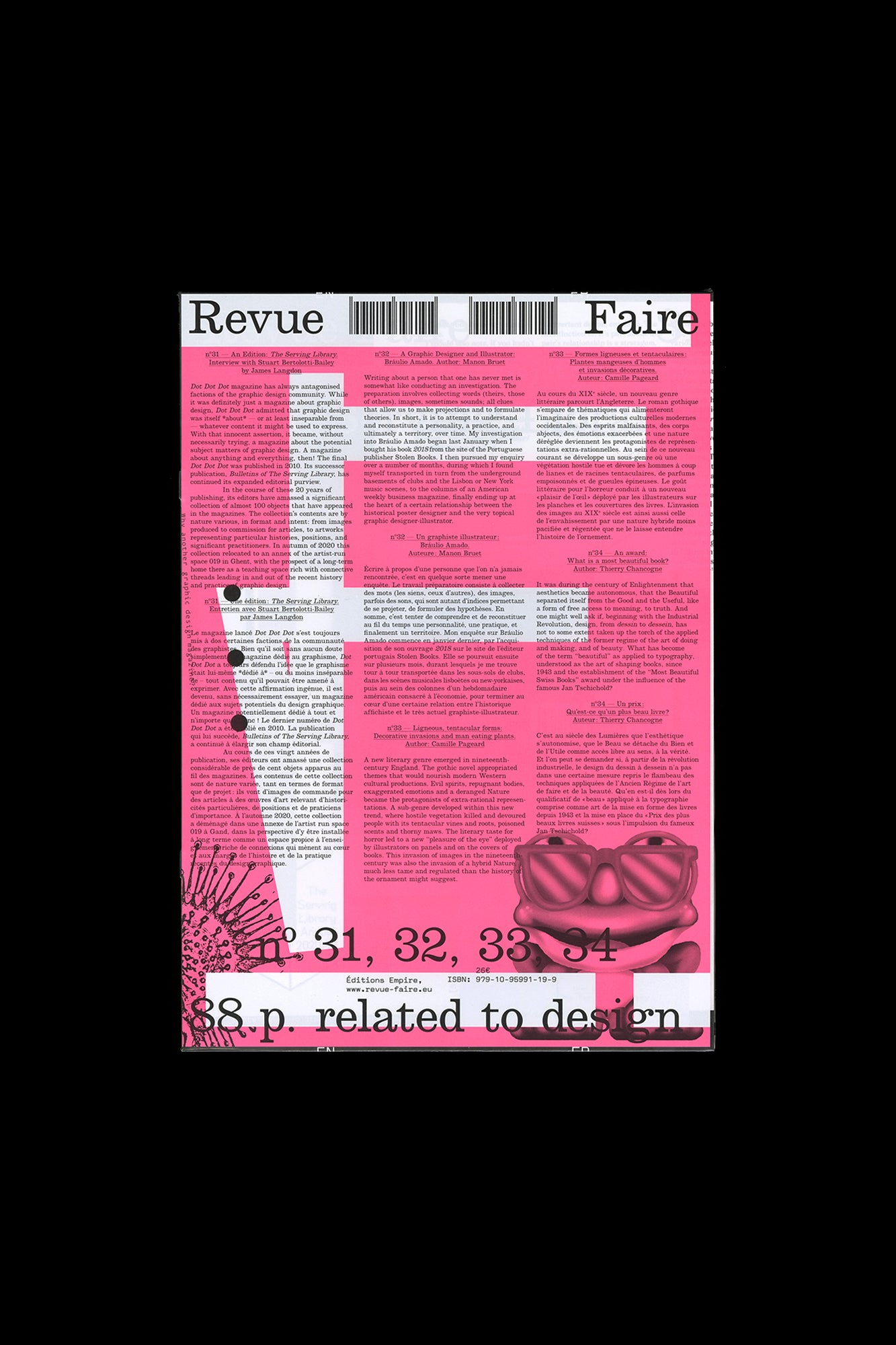
Revue Faire no. 31, 32, 33, 34
by Empire
ISBN: 9791095991199 Books books type design
Twenty Years of Despacio 2008–2028
by telekinesis
Books books research
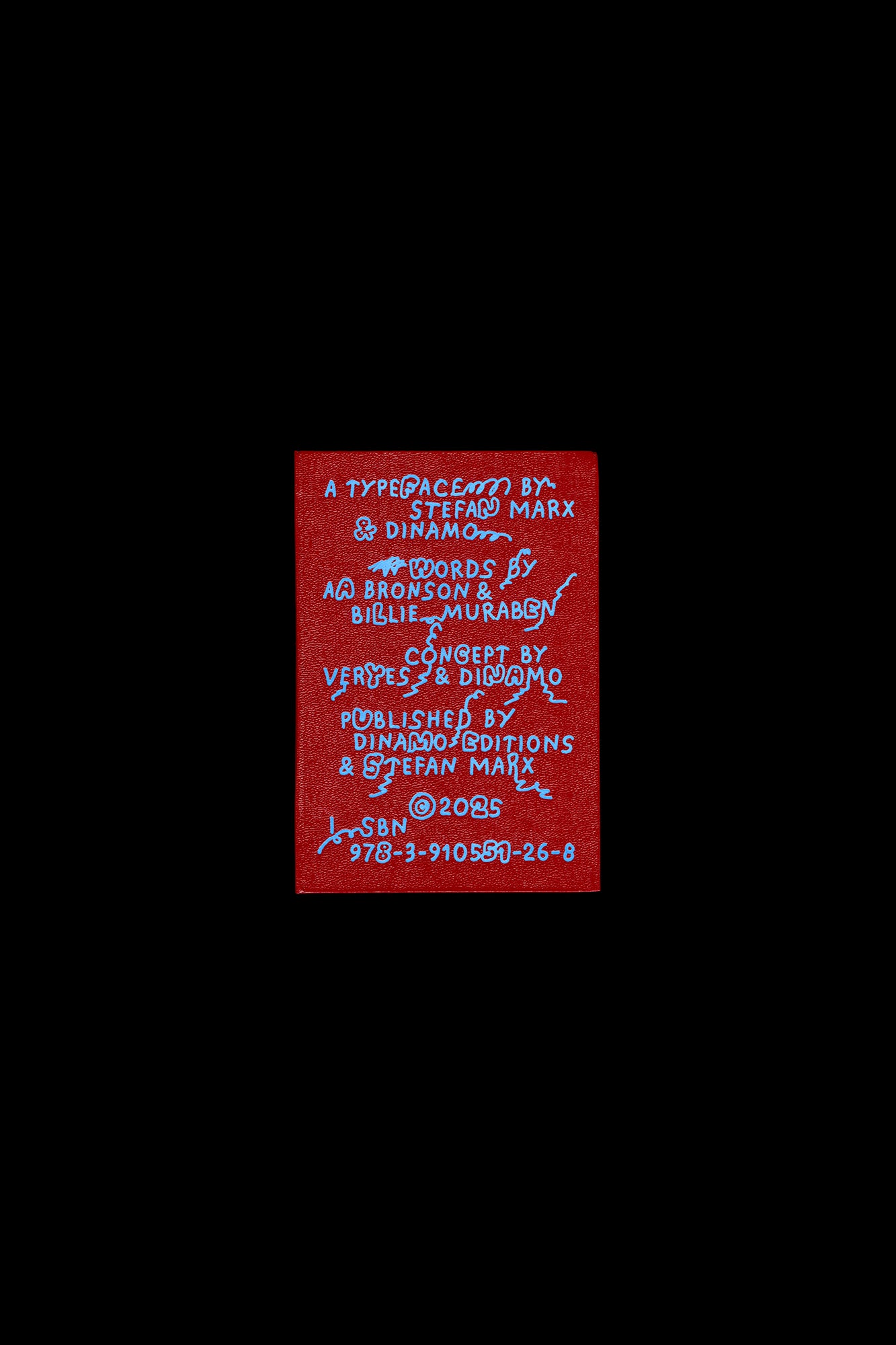
ABC Stefan by Stefan Marx
by Dinamo and veryes
ISBN: 9783910551268 Books type type design
A Subversive Gleam: Max Bill and His Time 1908–1939
by
Books bauhaus books
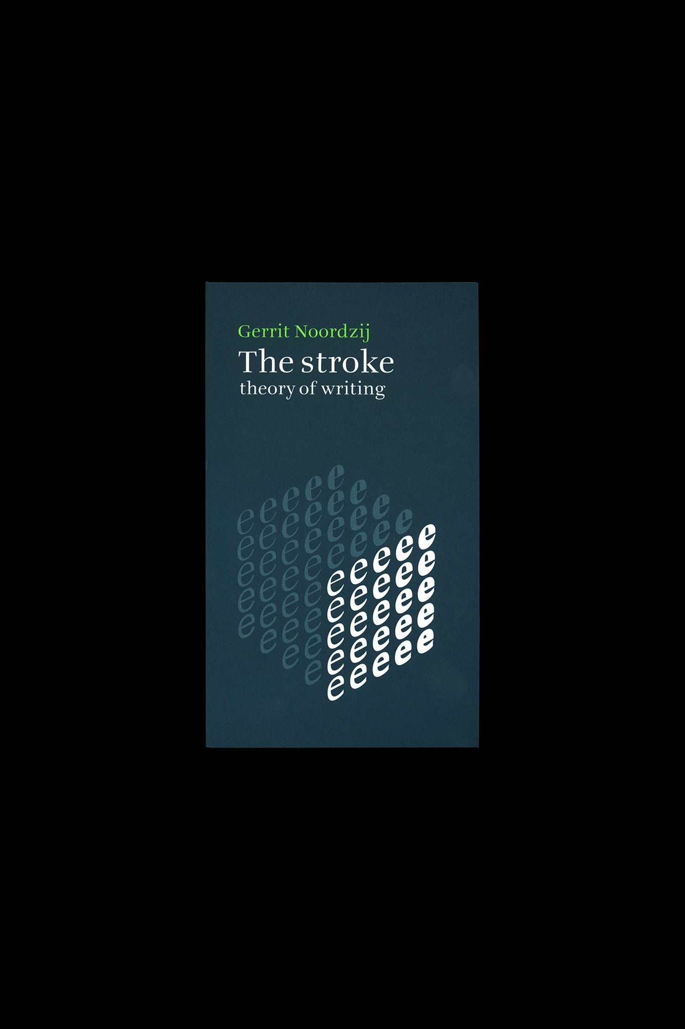
The Stroke: Theory Of Writing
by Hyphen Press
ISBN: 9789490913908 Books type design typefacedesign
Design Harder
by Erik Carter As the graphic design industry faces new cultural and ethical challenges
ISBN: 9798999412614 Books type type design
Forever Everett
by Nolan Paparelli
Books type type design
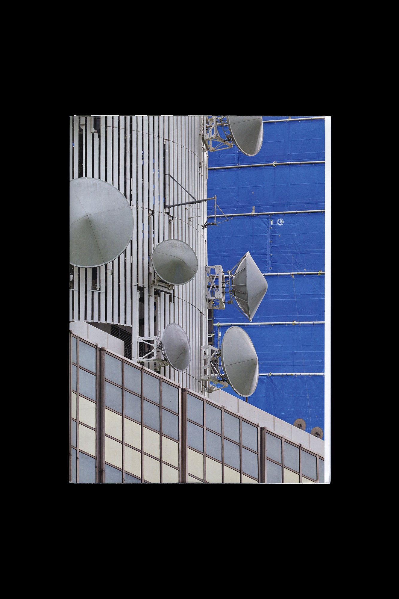
Aglaia Konrad: Japan Works
by postscript glosses written by architect and critic Julian Worrall
Books books
WhiteSpace
by curious digital icons and vertical typographic texts
Books books
Bedwyr Williams: Echt/70°
by Tai Shani
Books books
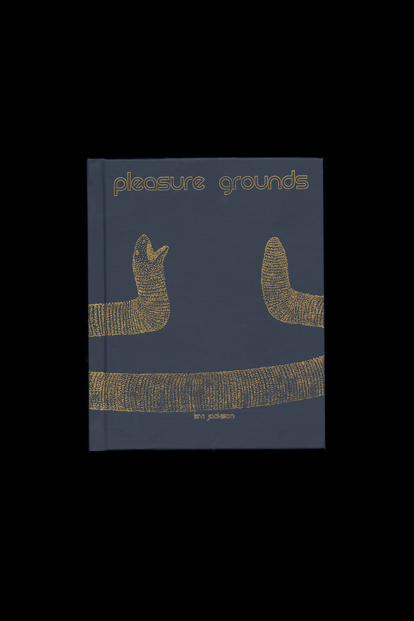
Levi Jackson:Pleasure Grounds
by Utah-based photographer Levi Jackson
ISBN: 9781516726462 Books books
David Rothenberg: Roosevelt Station
by crisis and division
Books books
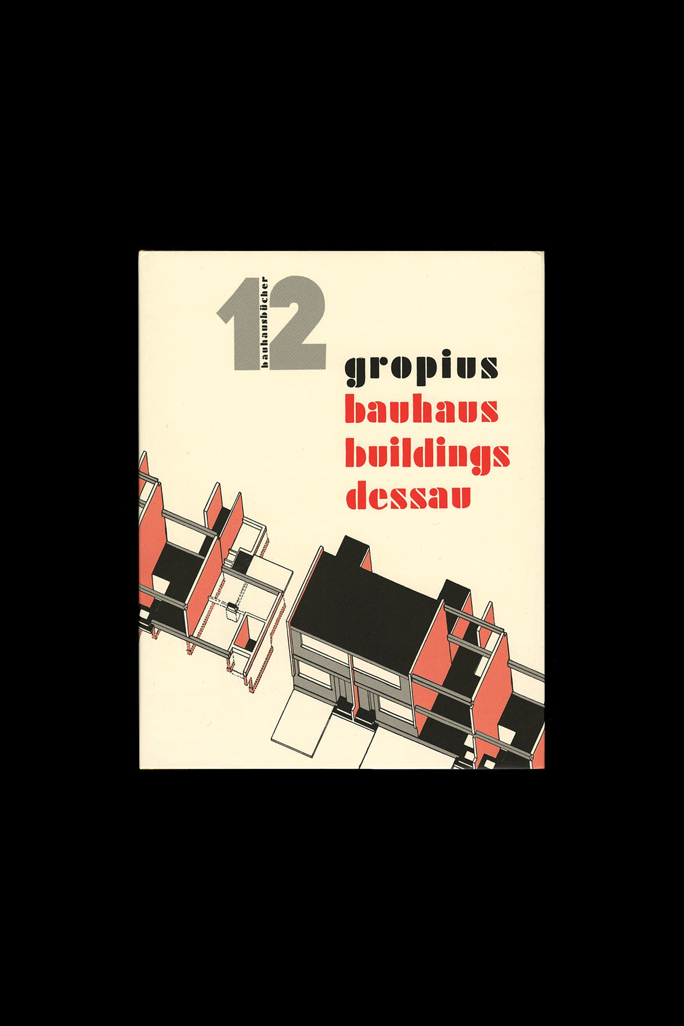
Bauhausbücher 12: Walter Gropius-Bauhaus Buildings Dessau
by Walter Gropius
Books books
Daisies
by Paige Silveria www
Books books
Graphic 50: Voice, Notes from Typojanchi 2023
by participating artists
Books research
PHILIPPE PARRENO: H {N)Y P N(Y} OSIS / HYPOTHESIS
by the appearance and orchestration of sounds and images
Books books
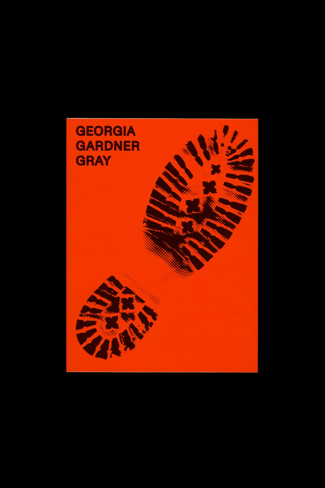
Georgia Gardner Gray
by her gender
ISBN: 9781590182680 Books books
L’Isola
by UNESCO in 2010 for the Atlas of the World’s Languages in Danger
ISBN: 9781647903619 Books books













Community Notes