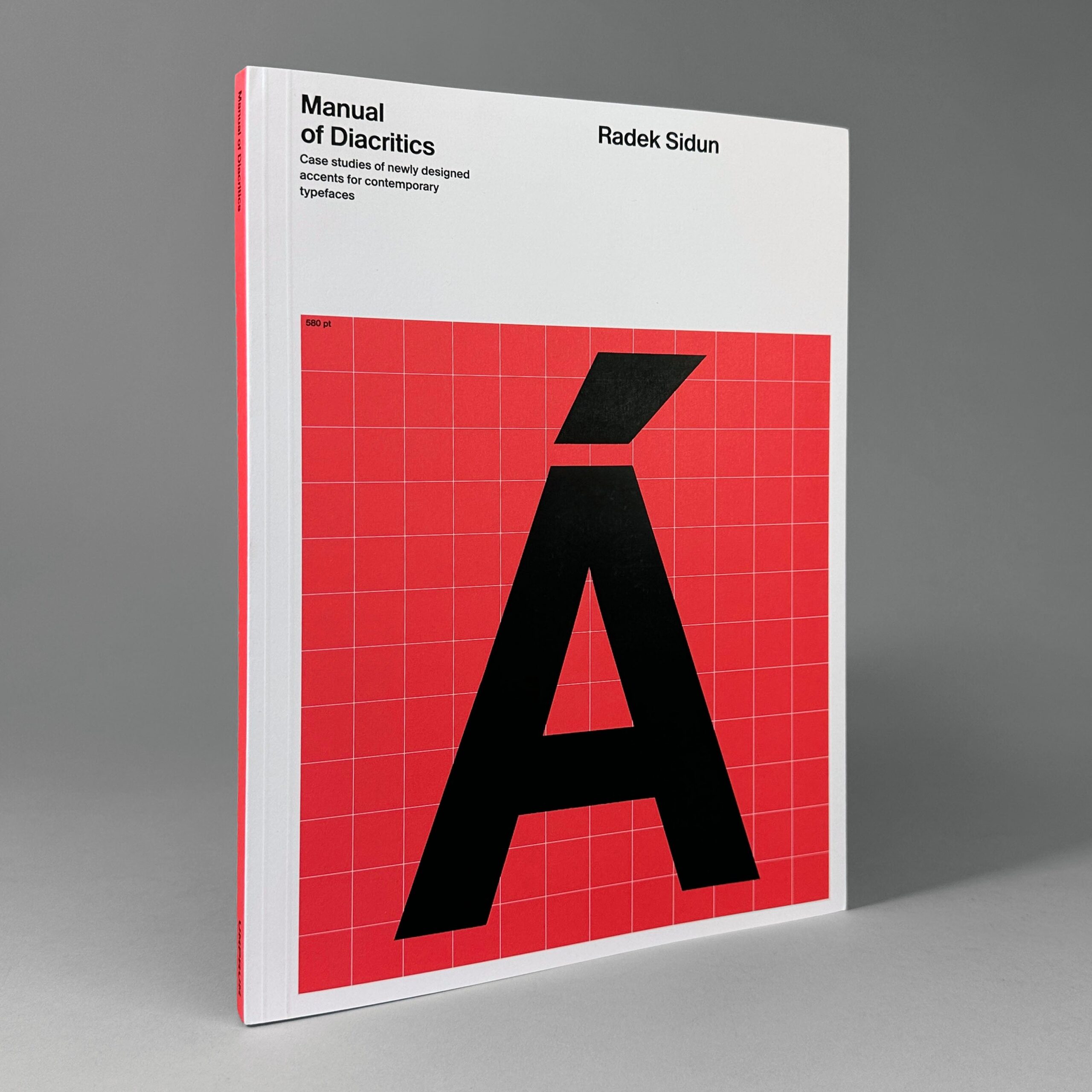
Manual of Diacritics
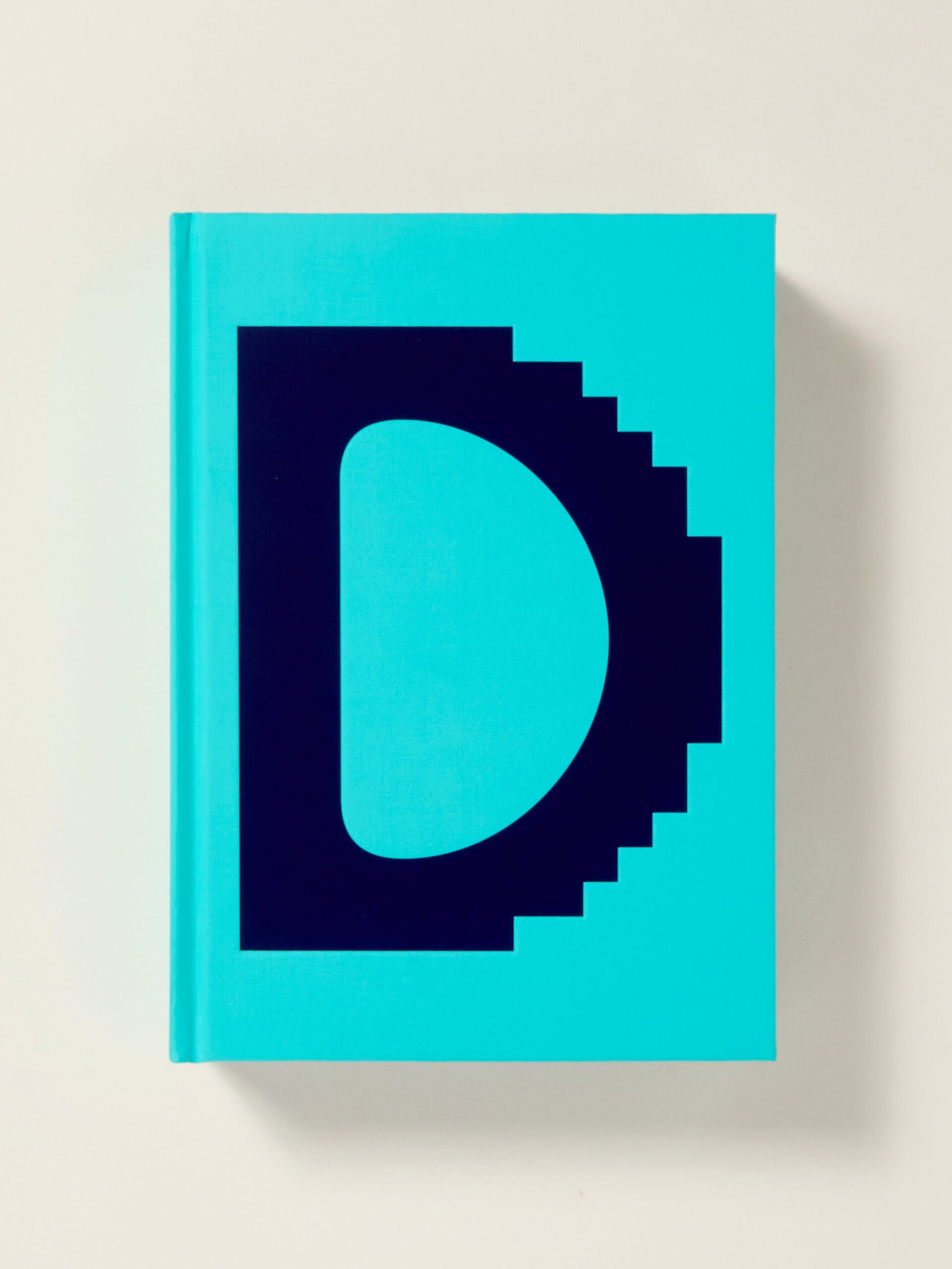
There are more than 70 languages in Europe using the Latin script. Some have disappeared, others are spoken by only a small part of the population, and there are only a few dozen of the most used ones. The 1990s, a time of rapid growth in digital typography, did not bring the same growth in interest in conceptual language support for typefaces, i.e., the creation of characters with diacritics. This gave rise to a situation well known to all graphic designers: a typeface they wanted to use in their design does not contain all the characters in their language. This pictorial textbook, developed by Czech type designer and educator Radek Sidun based on his familiarity with the needs of students in Type Design and Typography Studio at the Academy of Arts, Architecture and Design in Prague, is intended to be used by type designers who have a basic knowledge of typeface structure and crave diacritic-related guidance. As part of his labor producing this book, Sidun designed new accents (diacritics) for 15 exemplary typefaces from popular and commonly-used text families, deliberately choosing typefaces whose applications for the intended objectives cover most of the possible variants. Using 32 fonts in 15 different types with processed diacritical glyph sets, the Manual presents visual examples of possible solutions, using an illustrative approach for clarity. The book focuses support on 33 languages: Albanian, Bosnian, Catalan, Croatian, Czech, Danish, Dutch, Esperanto, Estonian, Faroese, Finnish, French, German, Hungarian, Icelandic, Italian, Latvian, Lithuanian, Maltese, Maori, Norwegian, Occitan, Polish, Portuguese, Romanian, Slovak Slovenian Serbian, Spanish, Swedish, Turkish Walloon, and Welsh. The approach and overview of principles is relevant for diacritic design work worldwide. "Diacritical accents are essential for comprehension in many languages, European and worldwide. Yet, their design is only sporadically addressed in education. Radek Sidun’s Manual is a sorely needed contribution that takes a visual-heavy approach. He went all the way and designed anew a full set of European accents for a range of famous typefaces, a wide palette of genres, often reinterpreting their original designs to show great improvements. The flawless illustrations show a view of how the accents for European languages ought to look like. Highly recommended to all designers trying to get oriented in the diacritical world." — David Březina, Rosetta Type Foundry "While there are amazing new typefaces popping up all over the world every day, they very often have one thing in common: improperly designed diacritics. And actually, we shouldn't be surprised, as there has been desperately little information on what correct accents should look like. But that's no longer the case. Radek's publication finally provides visual guidance on how to handle diacritics, and not just for common typefaces, but also for extreme cuts or calligraphic types. No more excuses, now every font can have perfect diacritics that respect local typographic traditions!" — Filip Blažek Conceived, written, and designed by Radek Sidun Edited by Karel Haloun and Jaroslav Tvrdoň Published by The Academy of Arts, Architecture & Design in Prague (UMPRUM), 2022 Second edition Softcover, 128 pages, 2-color offset, 8.5 × 11.25 inches ISBN 978-8-08-830817-1
Publisher
Curated
ISBN-13
9788088308171
ISBN-10
1696338603
Subjects
- Have:1
- Want:—
- Avg Rating:—
- Ratings:—



Community Notes