
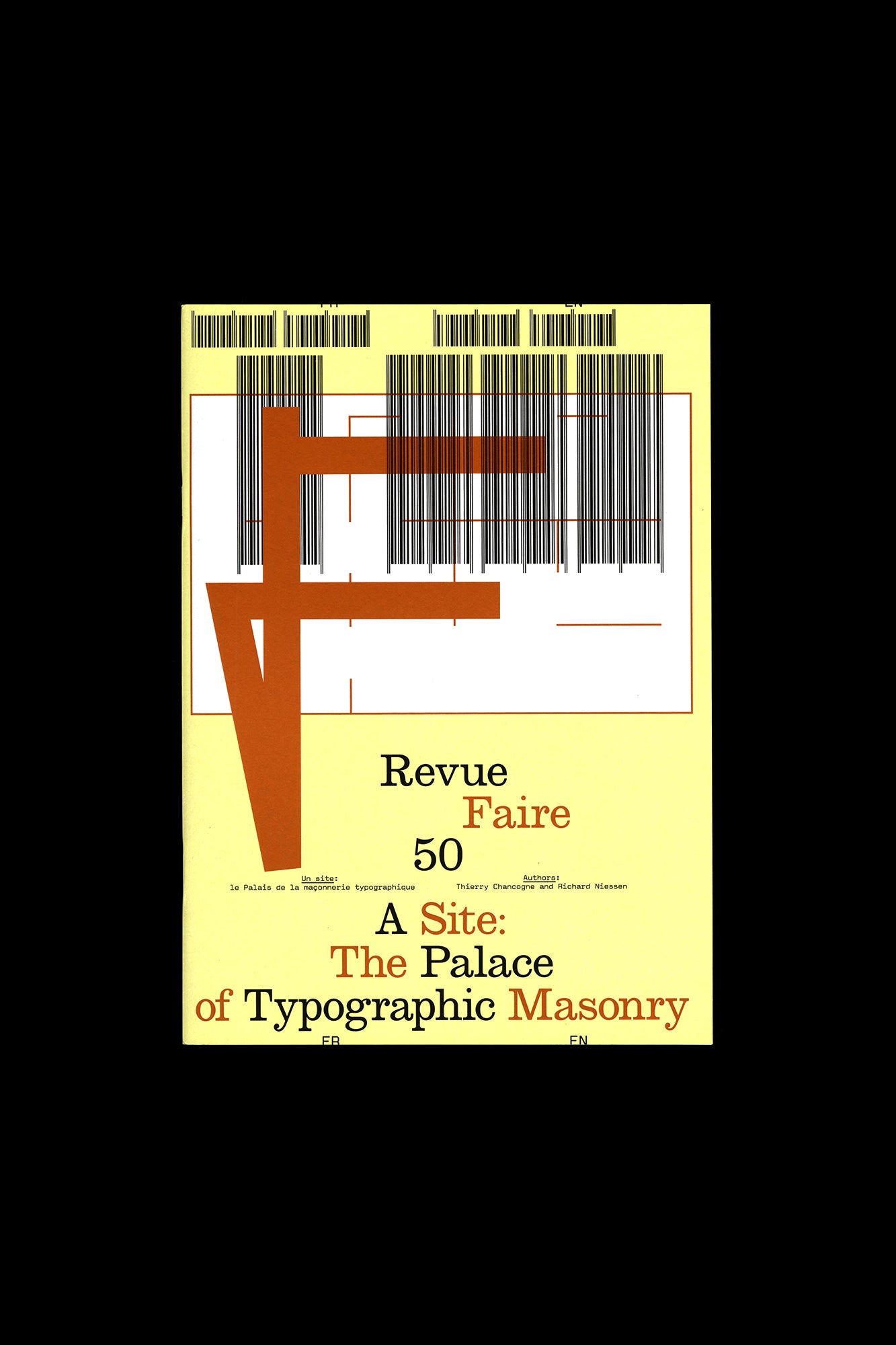
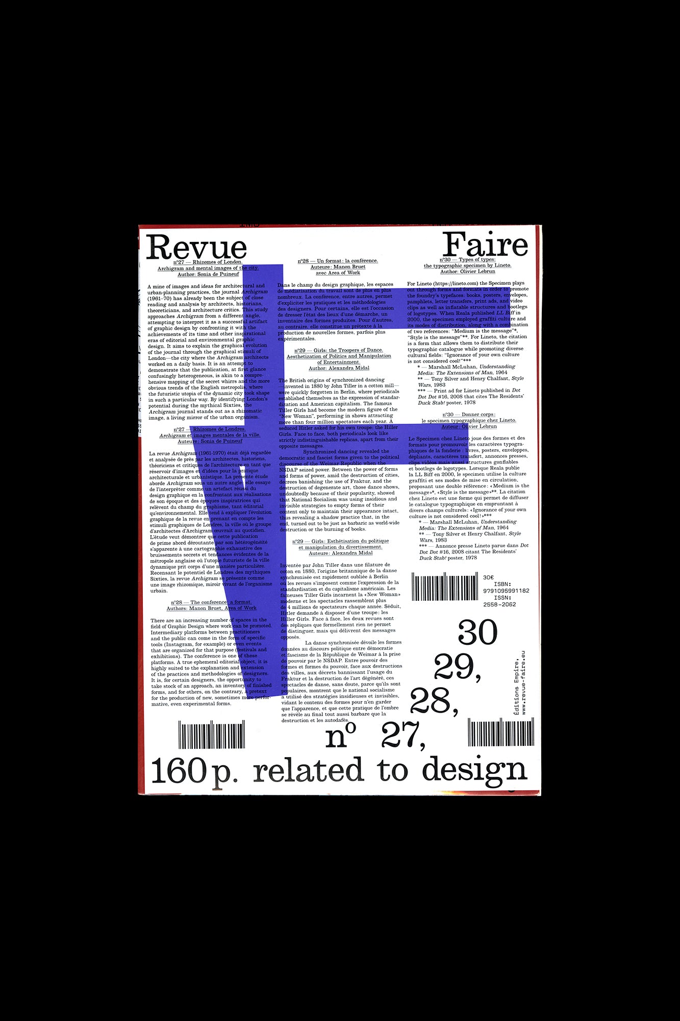
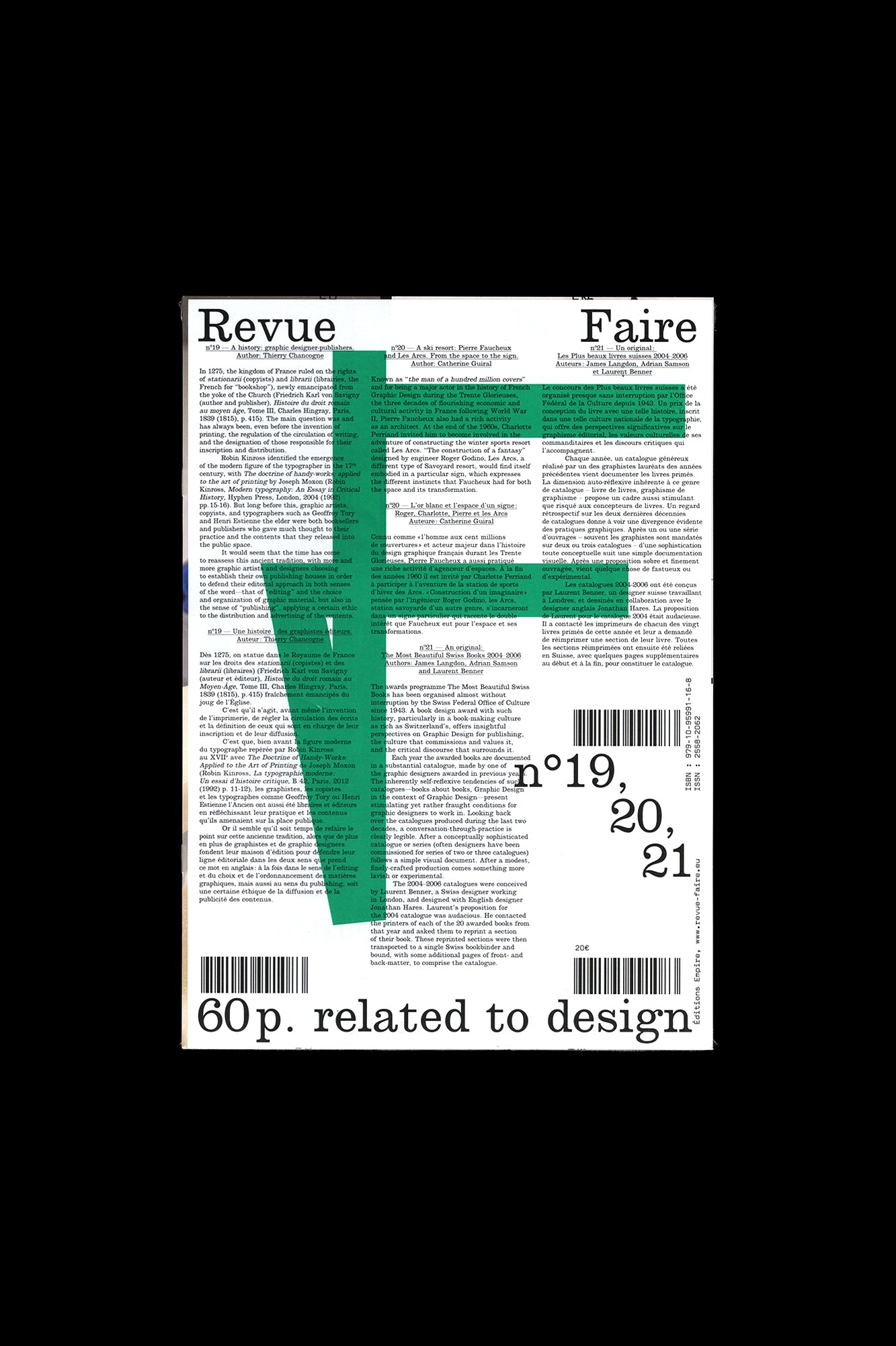
Revue Faire no. 42, 43, 44, 45
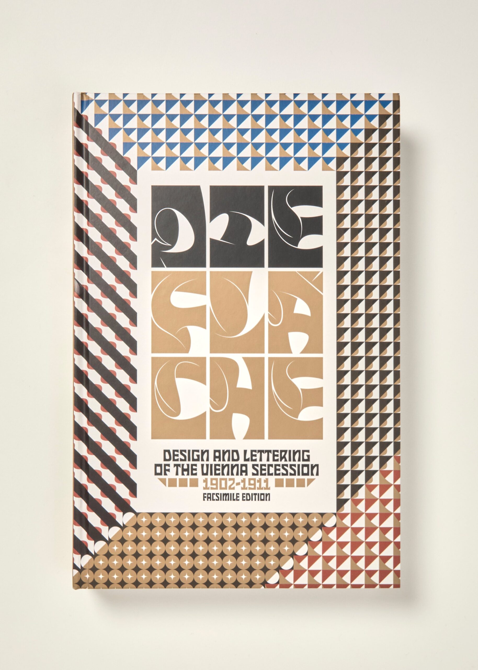
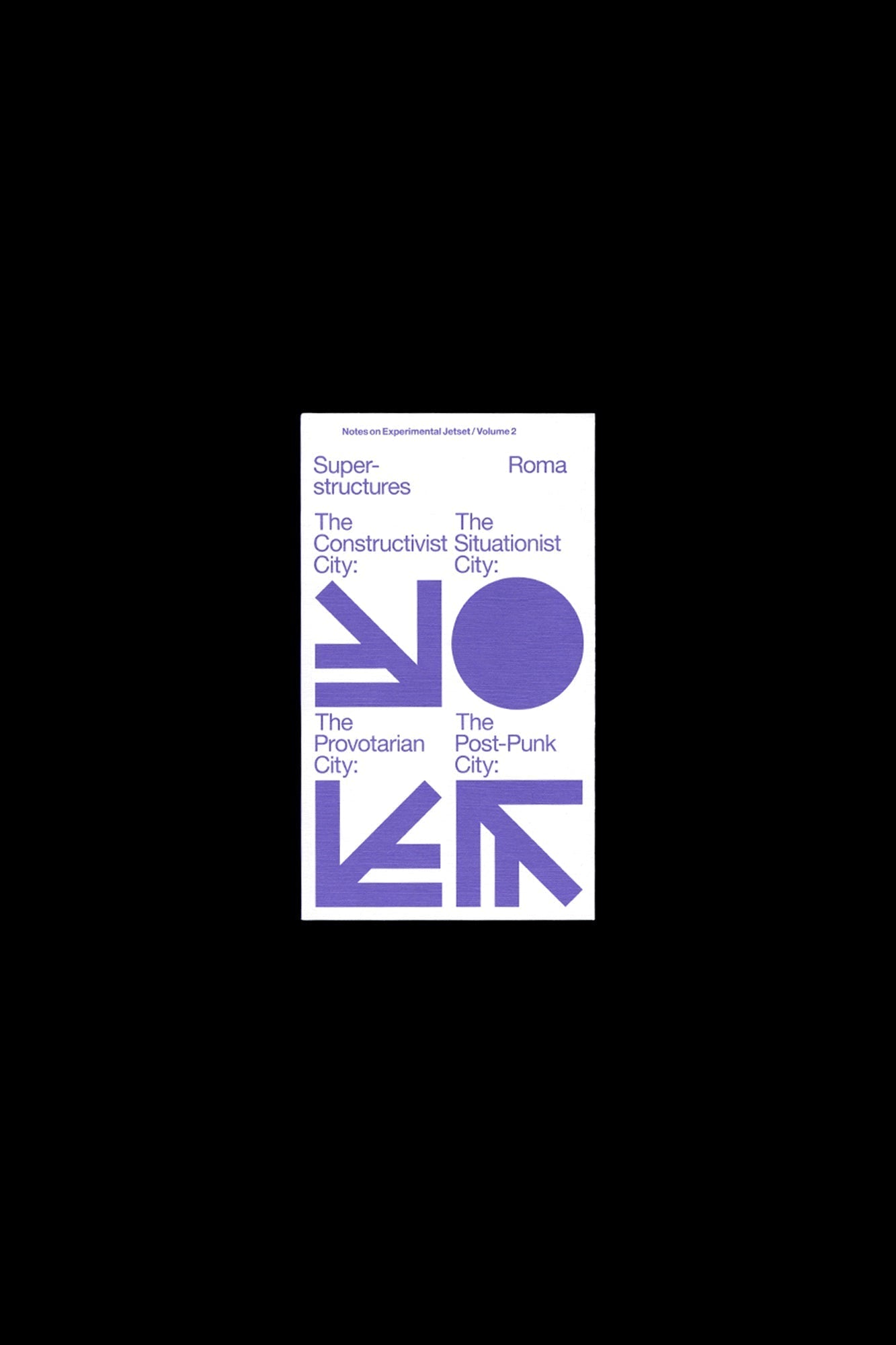
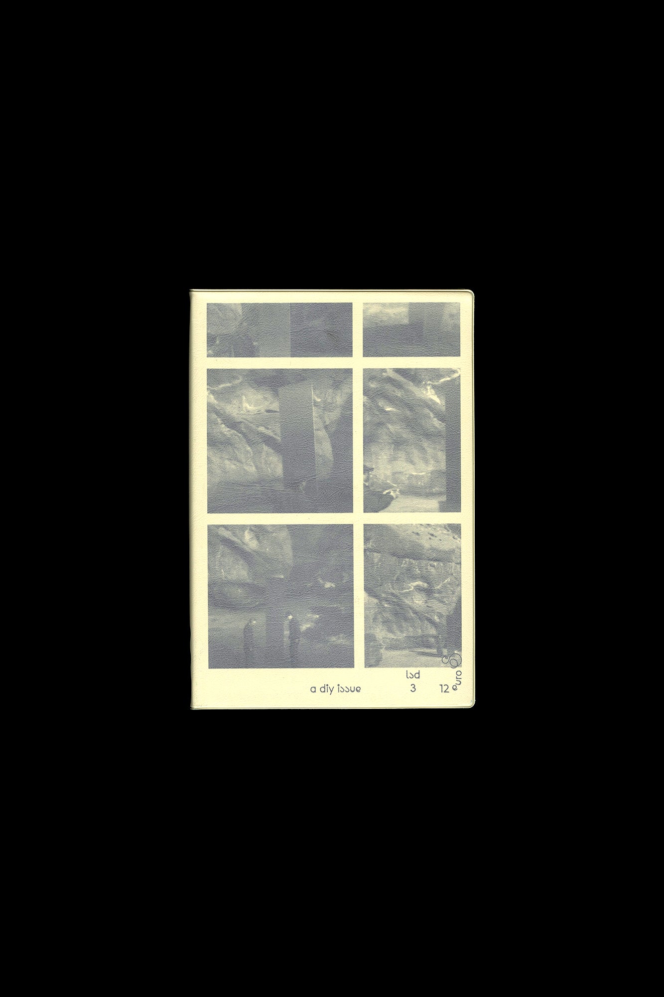
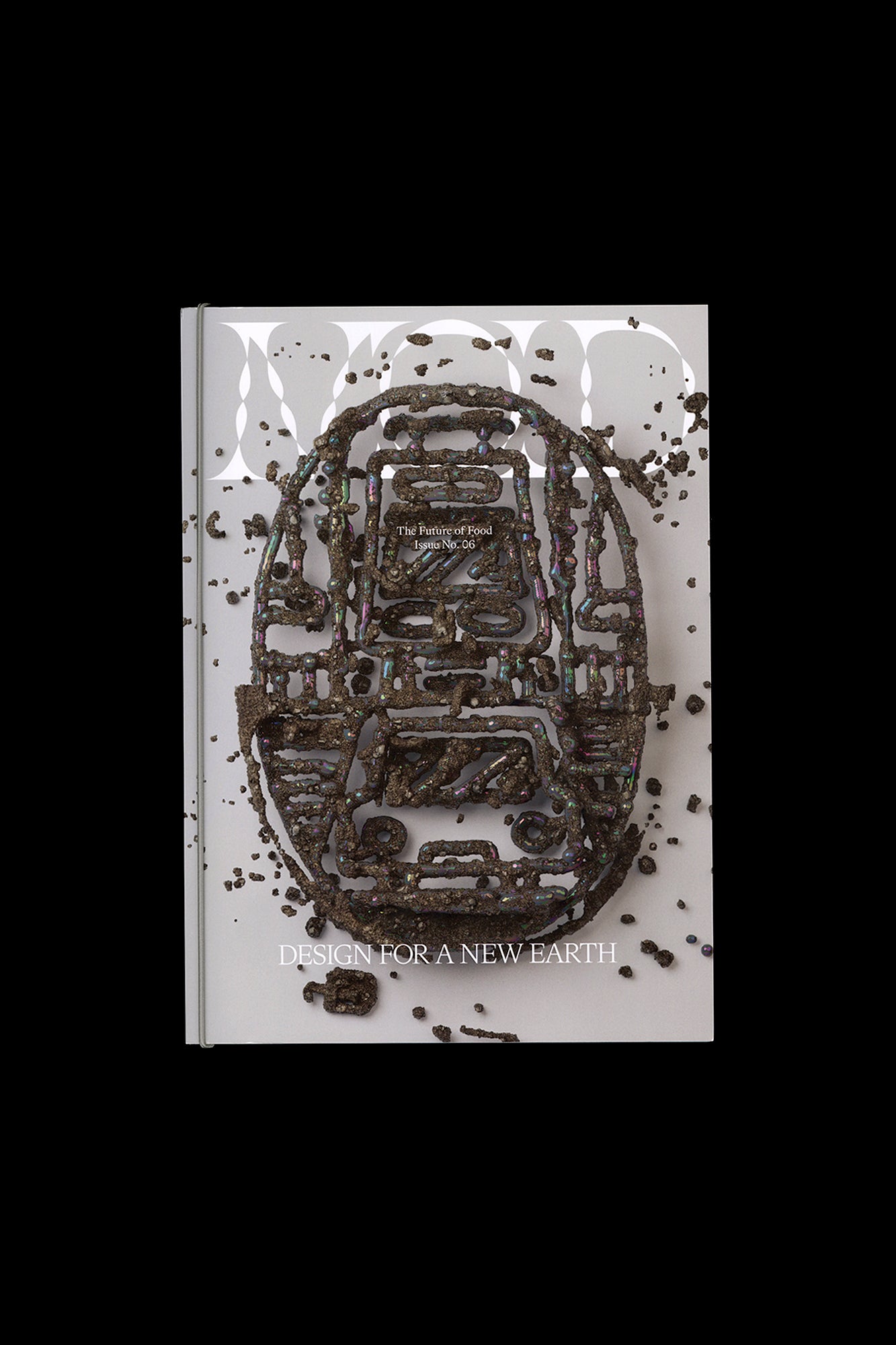
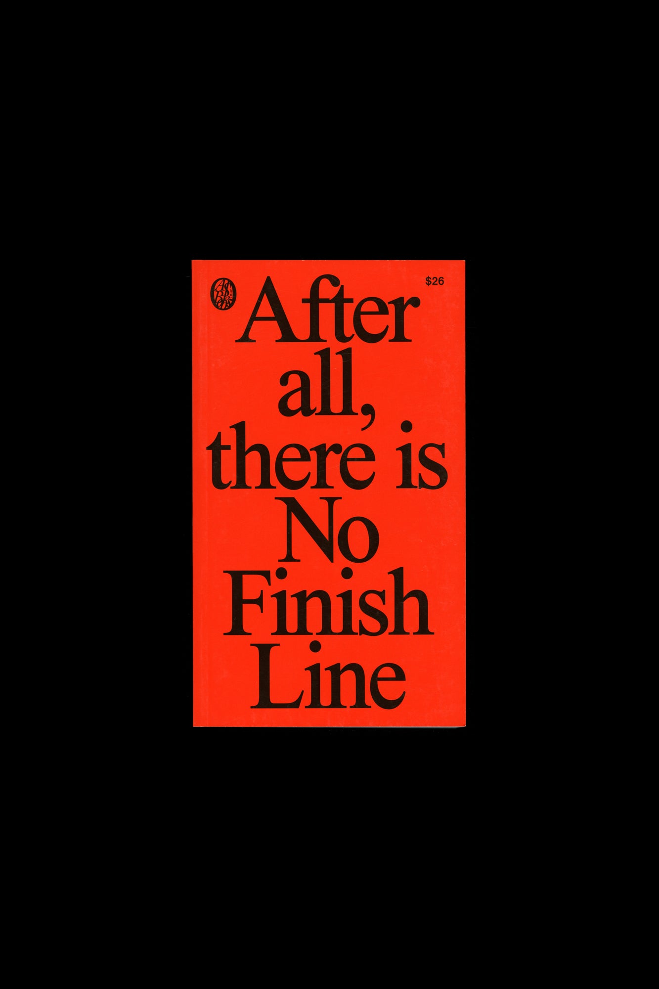
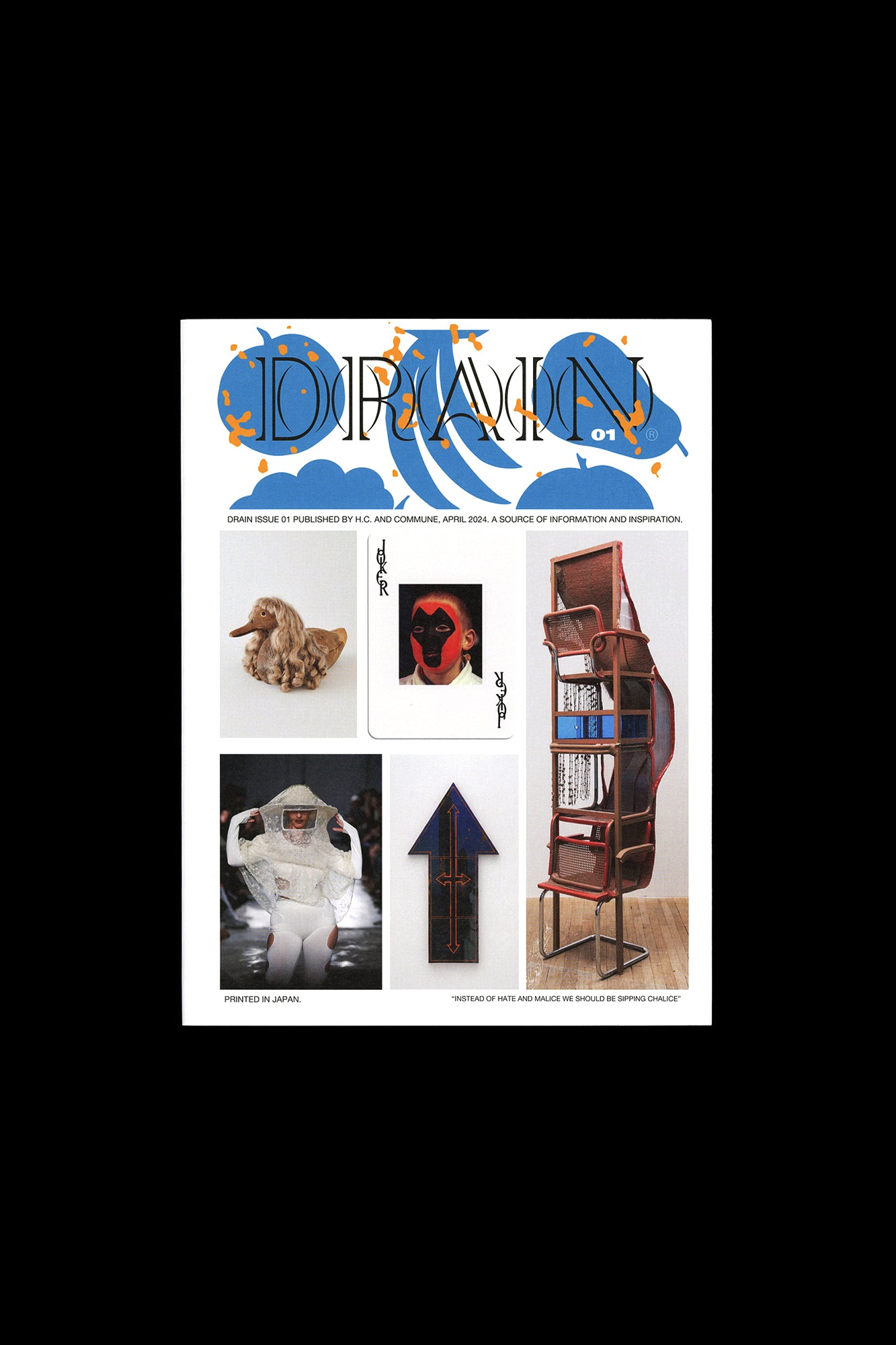
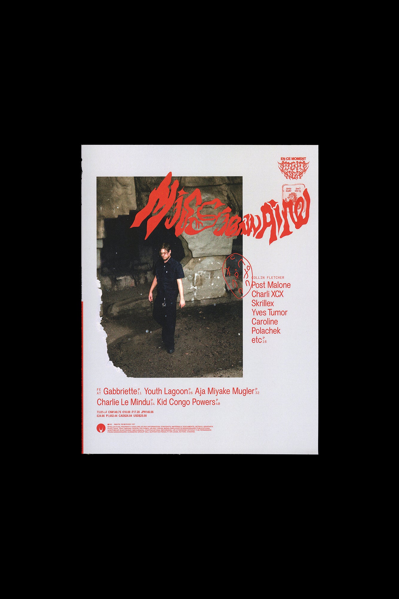
Faire is a bi-monthly publication dedicated to graphic design. Produced by Empire, the publishing arm of French design studio Syndicat (designers Sacha Léopold and François Havegeer), Faire is aimed at students as well as researchers and professional designers. Each issue addresses a specific object or theme and is written by a renowned author. This anthology set includes four issues, numbers 42 through 45, all produced in 2023: N° 42 — 12 ou 13 things I know about: F.R.DAVID by Victoire Le Bars and Benjamin Thorel You’ve heard it before: “Words, don’t come easy…” So how to write about F.R.DAVID , a journal that takes this very verse as its maxim? This installment of Faire proposes a non-comprehensive overview of the twenty issues of F.R.DAVID, from the complementary perspectives of two readers. An unclassifiable journal published since 2007, F.R.DAVID gathers texts, images, and documents, by various authors, pertaining to different eras; it is at the core of the work of Will Holder, its editor, who is developing with this project a compelling, and challenging, approach to the book form. Along the pages of F.R.DAVID the rhythms of words, typography, and voices connect, and a conversation with the reader is made central to the practice of publishing. N° 43 — "A typeface: 'Typographic writing'" by Thierry Chancogne In 1920, Francis Thibaudeau dedicated his manual of modern typography, La Lettre d’imprimerie , to Auriol, a letterer and typographer from the beginning of the century, whom he described as “the innovator of typographic writing.” The book is set using multiple variants of Auriol’s striking typefaces—notably the outline font Auriol-champlevé, the stencil Auriol labeur, the narrow Française Légère, and the bold Robur Noir. And it should be noted that perhaps the most widespread of these alphabets, Auriol labeur, is a typeface which defends both the pictorial dynamics of its components, visibly brushed with an august gesture, as well as the more-or-less industrial technicality of the bridges of this stencil typeface. One could be quite rightly struck by the oxymoron of so-called “typographic writing.” How does writing, along with its contingent, situated, and personal dynamics function in conjunction with the industrial and normative generalization of typography? Can a typeface, an abstract ideal, an orthographic contract, act upon historical movements and the specific and constantly renewed inclusion of alphabets? What happens to cursiveness when it is somehow “reclaimed” by the relatively definitive, or at the very least perennial, form of fonts? N° 44 — "A conundrum: the visual communication of neuroscience" by James Langdon Neuroscience is a visual science. Our understanding of the brain’s biology originates in the beautiful and pioneering images of neurons and dendrites produced by Santiago Ramón y Cajal and Camillo Golgi in the late nineteenth century. In recent decades neuroscience has embraced computational imaging. We have witnessed dynamic images of living brains produced by fMRI, and intricate, colourful representations of “neutral connectomics” that promise ultimately to reveal the ‘wiring diagram’ of the human brain. Such images are not merely the documentation of scientific work, they are themselves primary sites of research. The images are the science. And yet the interaction of neuroscience with mainstream visual culture tends toward the simplistic and the amateurish. Science communication seems to regard graphic design and art direction sceptically, preferring to contextualise its technical images with a collage of cartoons, internet memes, and generic high-tech stock photography. The emerging neurotechnology industry, by contrast, adopts the visual language of corporate “big tech”. Billionaire entrepreneur Elon Musk’s Neuralink project presents its experimental neural implant technology as if it were an innocent commercial appliance. These observations are urgent. Inevitably neuroscience will soon yield opportunities for technologically augmenting the human brain that could further entrench inequality and stratification in our society. This text is not a call for more friendly interdisciplinary collaboration between graphic design and neuroscience, but a pointed critical assessment of the visual literacy of one field from the perspective of another. N° 44 — "Made Redundant (4 Templates)" by Stuart Bertolotti-Bailey Templates in graphic design are usually associated with convenience and efficiency, their dual purpose being to speed up work by circumventing the need to make decisions, and to ensure consistency by restricting the parameters of possibility. But they can be deployed in less reductive, more enterprising ways too. This essay recounts the development of four projects made with various collaborators, each involving a very particular template conceived in such a spirit. Classified here as the “Generative Headache,” the “Meeting Point,” the “Happy Medium,” and the “Industry Default,” these four types trace the gradual shift from physical to digital media over the last couple of decades. Published by Editions Empire Bilingual, in French and English 148 pages total, each issue separately bound, b&w and color images, 8.25 × 11.75 inches ISBN: 979-1-09-599142-7
Publisher
Editions Empire
ISBN-13
9791095991427
Subjects
- Have:1
- Want:—
- Avg Rating:—
- Ratings:—
Community Notes