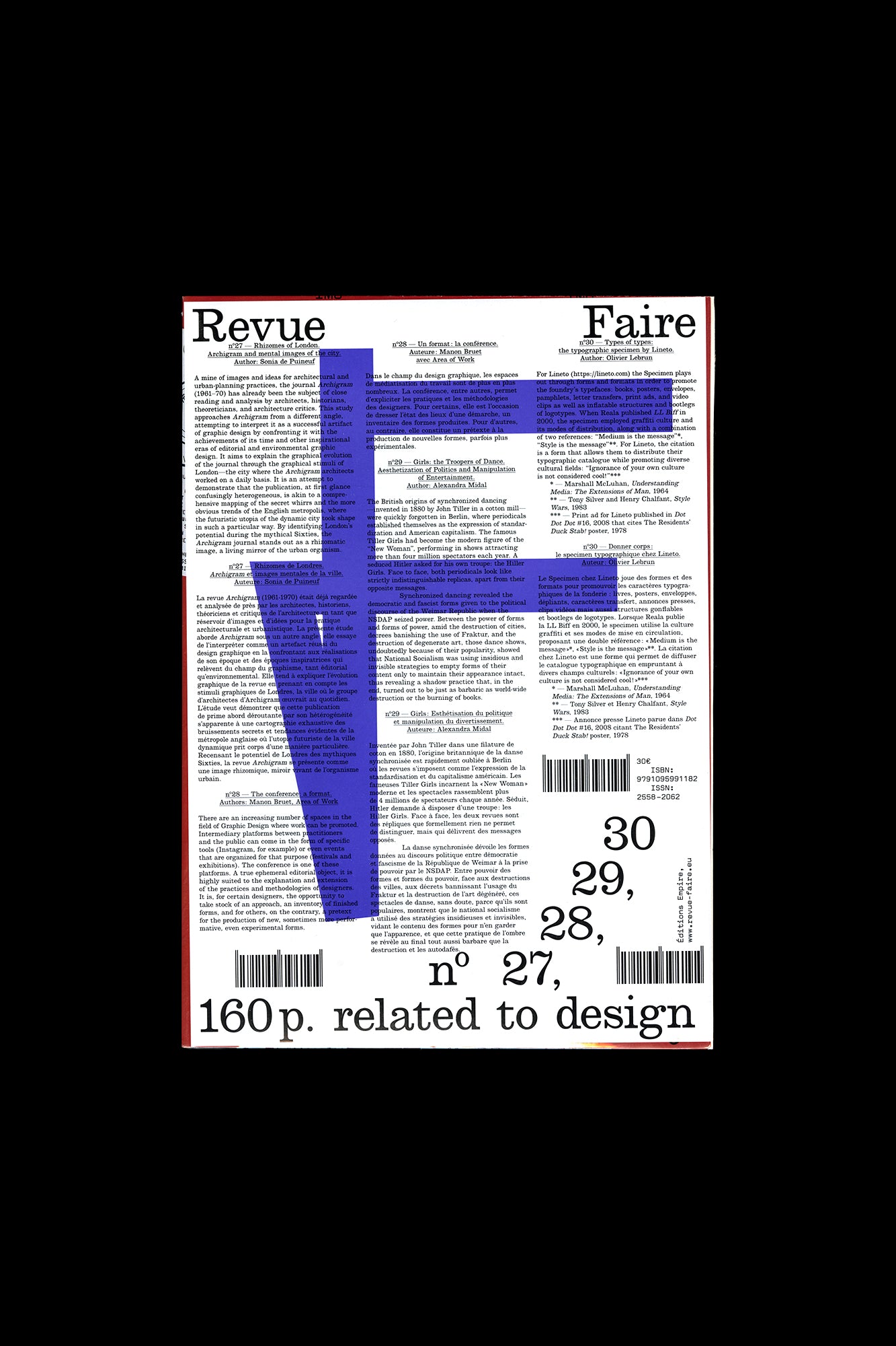
Revue Faire no. 27, 28, 29, 30
Faire is a bi-monthly publication dedicated to graphic design. Produced by Empire, the publishing arm of French design studio Syndicat (designers Sacha Léopold and François Havegeer), Faire is aimed at students as well as researchers and professional designers. Each issue addresses a specific object or theme and is written by a renowned author. This anthology set includes four issues, numbers 27 through 30: N° 27 — Rhizomes of London. Archigram and mental images of the city. By Sonia de Puineuf A mine of images and ideas for architectural and urban-planning practices, the journal Archigram (1961–70) has already been the subject of close reading and analysis by architects, historians, theoreticians, and architecture critics. This study approaches Archigram from a different angle, attempting to interpret it as a successful artifact of graphic design by confronting it with the achievements of its time and other inspirational eras of editorial and environmental graphic design. It aims to explain the graphical evolution of the journal through the graphical stimuli of London—the city where the Archigram architects worked on a daily basis. It is an attempt to demonstrate that the publication, at first glance confusingly heterogeneous, is akin to a comprehensive mapping of the secret whirrs and the more obvious trends of the English metropolis, where the futuristic utopia of the dynamic city took shape in such a particular way. By identifying London’s potential during the mythical Sixties, the Archigram journal stands out as a rhizomatic image, a living mirror of the urban organism. N° 28 — The conference: a format. By Manon Bruet and Area of Work There are an increasing number of spaces in the field of Graphic Design where work can be promoted. Intermediary platforms between practitioners and the public can come in the form of specific tools (Instagram, for example) or even events that are organized for that purpose (festivals and exhibitions). The conference is one of these platforms. A true ephemeral editorial object, it is highly suited to the explanation and extension of the practices and methodologies of designers. It is, for certain designers, the opportunity to take stock of an approach, an inventory of finished forms, and for others, on the contrary, a pretext for the production of new, sometimes more performative, even experimental forms. N° 29 — Girls , the Troopers of Dance. Aesthetization of Politics and Manipulation of Entertainment. By Alexandra Midal The British origins of synchronized dancing—invented in 1880 by John Tiller in a cotton mill—were quickly forgotten in Berlin, where periodicals established themselves as the expression of standardization and American capitalism. The famous Tiller Girls had become the modern figure of the “New Woman”, performing in shows attracting more than four million spectators each year. A seduced Hitler asked for his own troupe: the Hiller Girls. Face to face, both periodicals look like strictly indistinguishable replicas, apart from their opposite messages. Synchronized dancing revealed the democratic and fascist forms given to the political discourse of the Weimar Republic when the NSDAP seized power. Between the power of forms and forms of power, amid the destruction of cities, decrees banishing the use of Fraktur, and the destruction of degenerate art, those dance shows, undoubtedly because of their popularity, showed that National Socialism was using insidious and invisible strategies to empty forms of their content only to maintain their appearance intact, thus revealing a shadow practice that, in the end, turned out to be just as barbaric as world-wide destruction or the burning of books. N° 30 — Types of types: the typographic specimen by Lineto. By Olivier Lebrun For Lineto (https://lineto.com) the Specimen plays out through forms and formats in order to promote the foundry’s typefaces: books, posters, envelopes, pamphlets, letter transfers, print ads, and video clips as well as inflatable structures and bootlegs of logotypes. When Reala published LL Biff in 2000, the specimen employed graffiti culture and its modes of distribution, along with a combination of two references: “Medium is the message”*, “Style is the message”**. For Lineto the citation is a form that allows them to distribute their typographic catalogue while promoting diverse cultural fields: “Ignorance of your own culture is not considered cool!”*** * — Marshall McLuhan, Understanding Media: The Extensions of Man , 1964 ** — Tony Silver and Henri Chalfant, Style Wars , 1983 *** — Print ad for Lineto published in Dot Dot Dot #16, 2008 that cites The Residents, Duck Stab Poster, 1978 Published by Editions Empire Bilingual, in French and English 160 pages total, each issue separately bound, b&w and color images, 8.25 × 11.75 inches ISBN: 979-1-09-599118-2
Publisher
Editions Empire
ISBN-13
9791095991182
Subjects
- Have:1
- Want:—
- Avg Rating:—
- Ratings:—

Community Notes