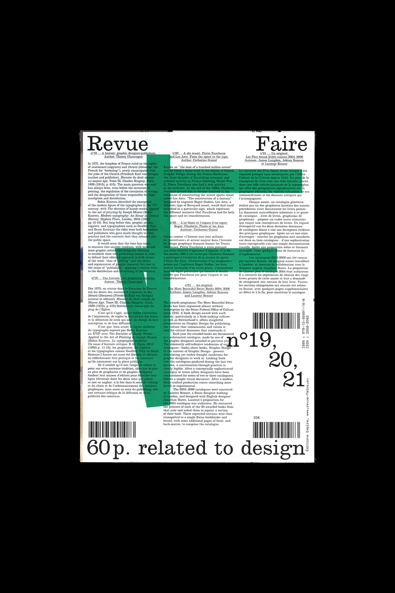
Revue Faire no. 19, 20, 21
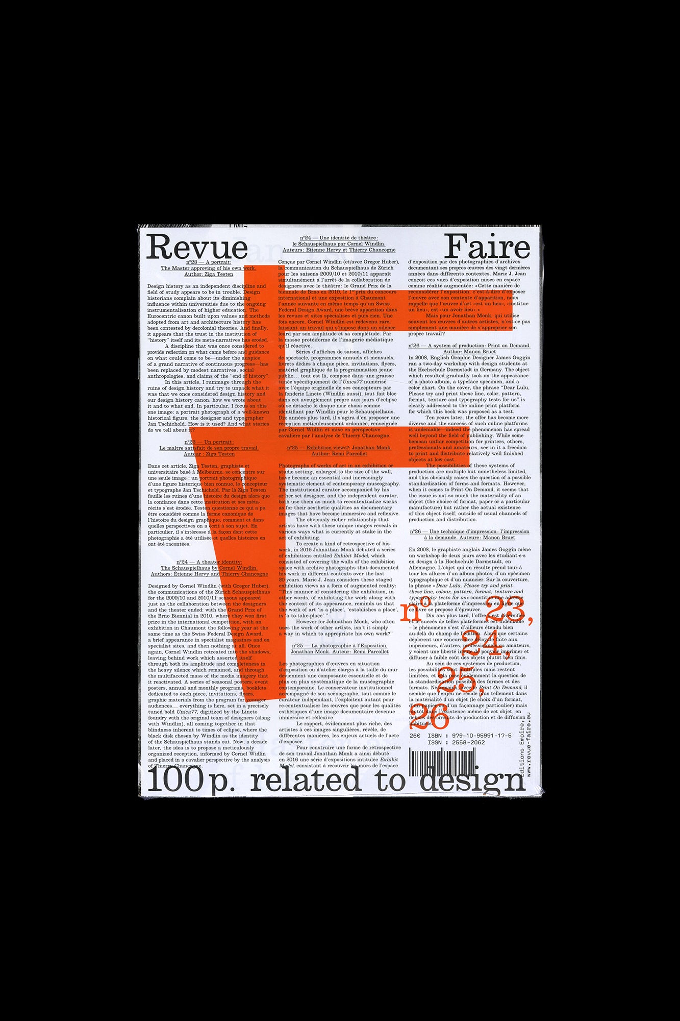
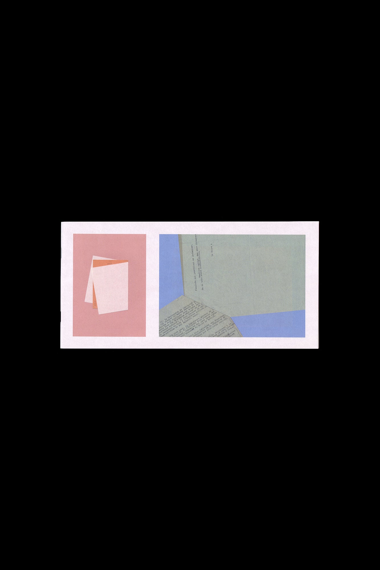
Faire is a bi-monthly publication dedicated to graphic design. Produced by Empire, the publishing arm of French design studio Syndicat (designers Sacha Léopold and François Havegeer), Faire is aimed at students as well as researchers and professional designers. Each issue addresses a specific object or theme and is written by a renowned author. This anthology set, volume 6, includes three issues, numbers 19 through 21: n°19 — A history: graphic designer-publishers. By Thierry Chancogne In 1275, the kingdom of France ruled on the rights of s tationarii (copyists) and librarii ( librairies , the French for “bookshop”), newly emancipated from the yoke of the Church (Friedrich Karl von Savigny (author and publisher), Histoire du droit romain au moyen âge , Tome III, Charles Hingray, Paris, 1839 (1815), p. 415). The main question was and has always been, even before the invention of printing, the regulation of the circulation of writing, and the designation of those responsible for their inscription and distribution. Robin Kinross identified the emergence of the modern figure of the typographer in the 17 th century, with The doctrine of handy-works: applied to the art of printing by Joseph Moxon (Robin Kinross, Modern typography: An Essay in Critical History , Hyphen Press, London, 2004 (1992) pp. 15-16). But long before this, graphic artists, copyists, and typographers such as Geoffroy Tory and Henri Estienne the elder were both booksellers and publishers who gave much thought to their practice and the contents that they released into the public space. It would seem that the time has come to reassess this ancient tradition, with more and more graphic artists and designers choosing to establish their own publishing houses in order to defend their editorial approach in both senses of the word—that of “editing” and the choice and organization of graphic material, but also in the sense of “publishing”, applying a certain ethic to the distribution and advertising of the contents. n°20 — A ski resort: Pierre Faucheux and Les Arcs. From the space to the sign. By Catherine Guiral Known as “the man of a hundred million covers” and for being a major actor in the history of French Graphic Design during the Trente Glorieuses, the three decades of flourishing economic and cultural activity in France following World War II, Pierre Faucheux also had a rich activity as an architect. At the end of the 1960s, Charlotte Perriand invited him to become involved in the adventure of constructing the winter sports resort called Les Arcs. “The construction of a fantasy” designed by engineer Roger Godino, Les Arcs, a different type of Savoyard resort, would find itself embodied in a particular sign, which expresses the different instincts that Faucheux had for both the space and its transformation. n°21 — An original: The Most Beautiful Swiss books 2004-2006. By James Langdon, Laurent Benner & Adrian Samson The awards competition, The Most Beautiful Swiss Books, has been organized almost without interruption by the Swiss Federal Office of Culture since 1943. A book design award with such history, particularly in a book-making culture as rich as Switzerland’s, offers insightful perspectives on Graphic Design for publishing, the culture that commissions and values it, and the critical discourse that surrounds it. Each year the awarded books are documented in a substantial catalogue, made by one of the graphic designers awarded in previous years. The inherently self-reflexive tendencies of such catalogues—books about books, Graphic Design in the context of Graphic Design—present stimulating yet rather fraught conditions for graphic designers to work in. Looking back over the catalogues produced during the last two decades, a conversation-through-practice is clearly legible. After a conceptually sophisticated catalogue or series (often designers have been commissioned for series of two or three catalogues) follows a simple visual document. After a modest, finely-crafted production comes something more lavish or experimental. The 2004–2006 catalogues were conceived by Laurent Benner, a Swiss designer working in London, and designed with English designer Jonathan Hares. Laurent’s proposition for the 2004 catalogue was audacious. He contacted the printers of each of the 20 awarded books from that year and asked them to reprint a section of their book. These reprinted sections were then transported to a single Swiss bookbinder and bound, with some additional pages of front- and back-matter, to comprise the catalogue. Published by Editions Empire, 2020 Bilingual, in French and English 60 pages total, each issue separately bound, b&w and color images, 8.25 × 11.75 inches ISBN: 979-1-09-599116-8
Publisher
Editions Empire
ISBN-13
9791095991168
Subjects
- Have:1
- Want:—
- Avg Rating:—
- Ratings:—















Community Notes