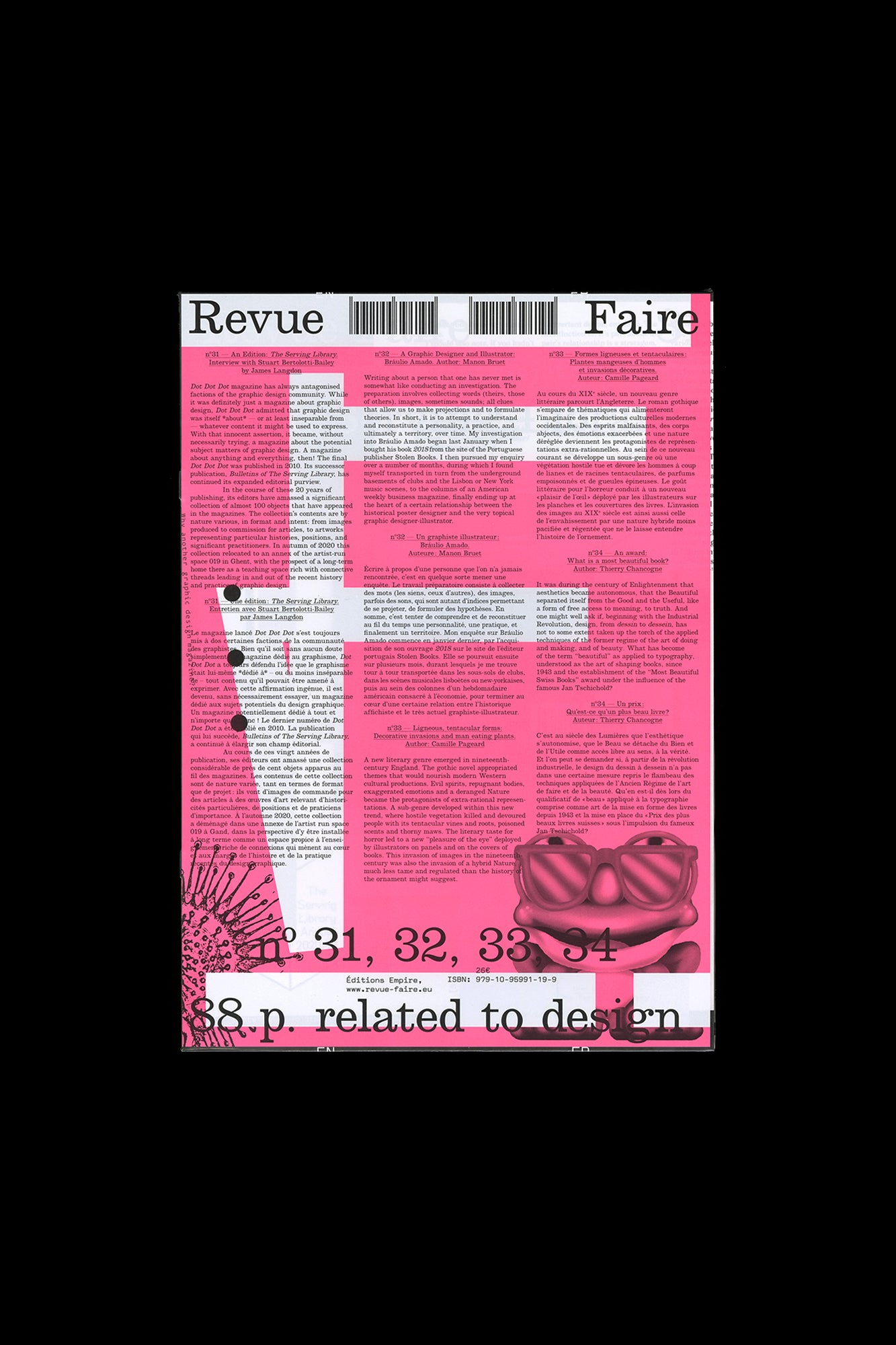
Revue Faire no. 31, 32, 33, 34
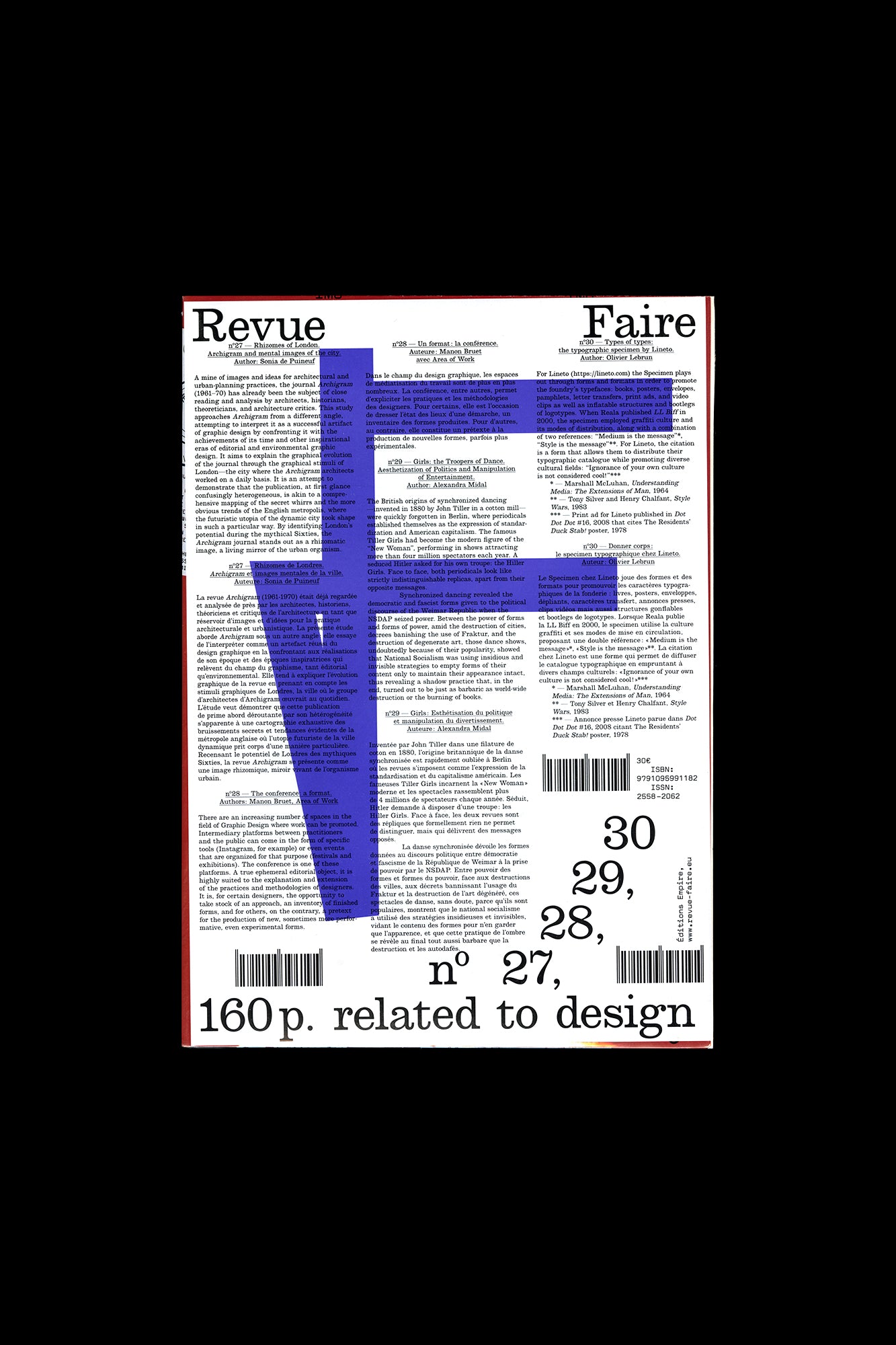
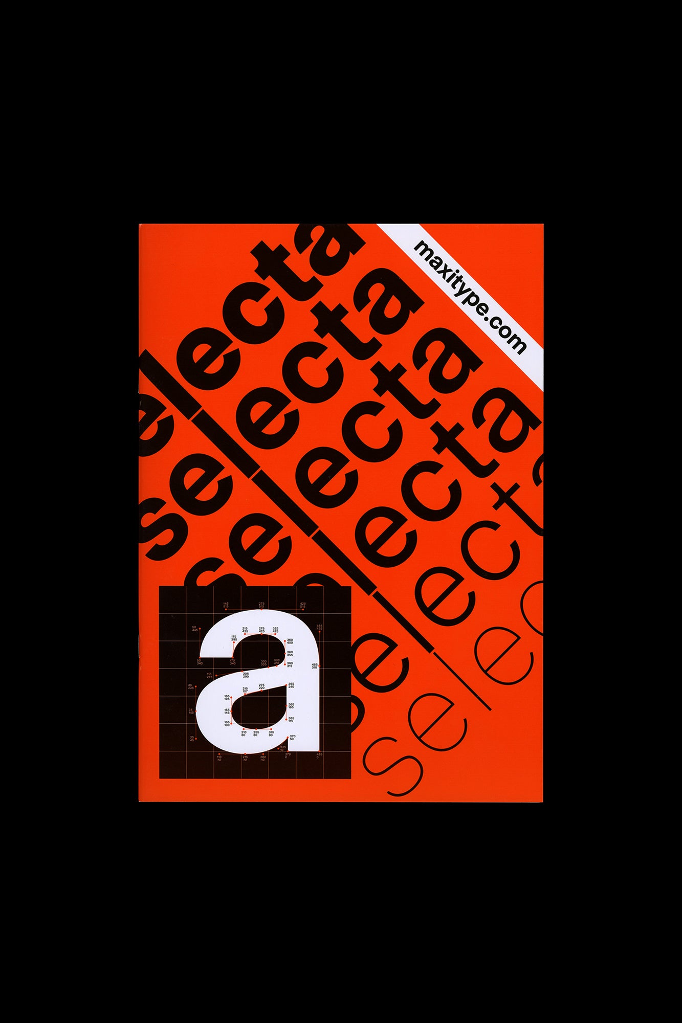
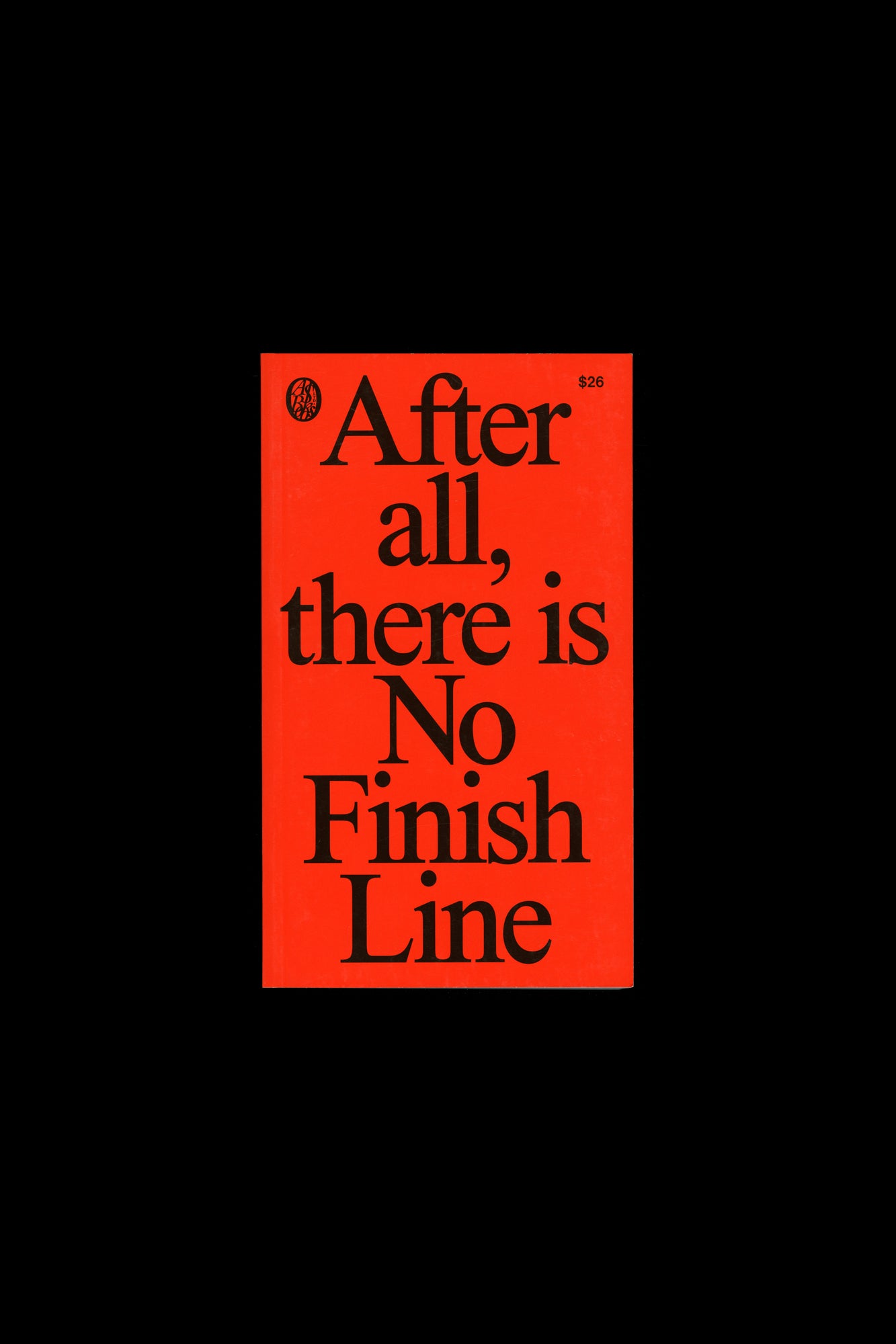
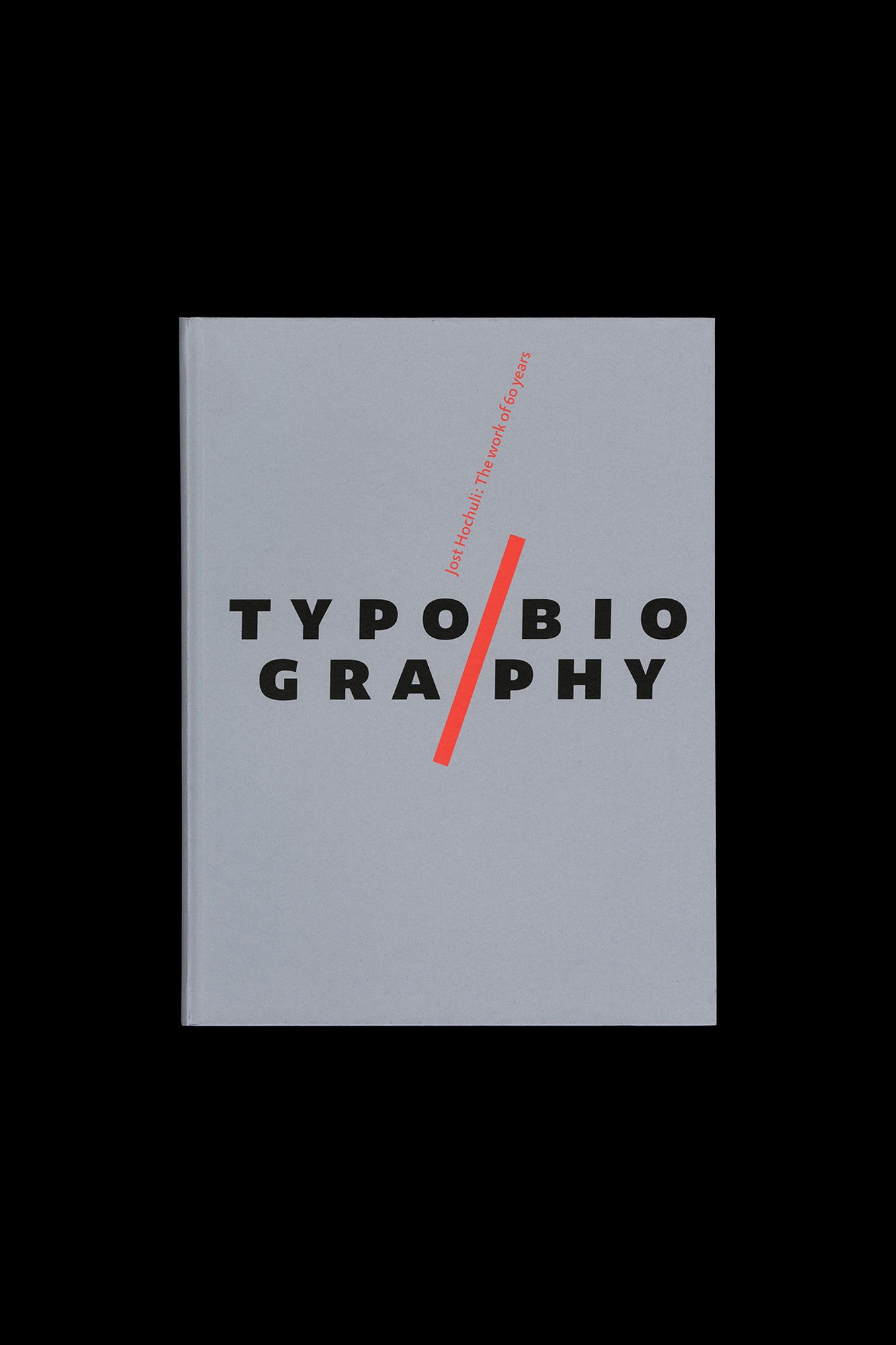
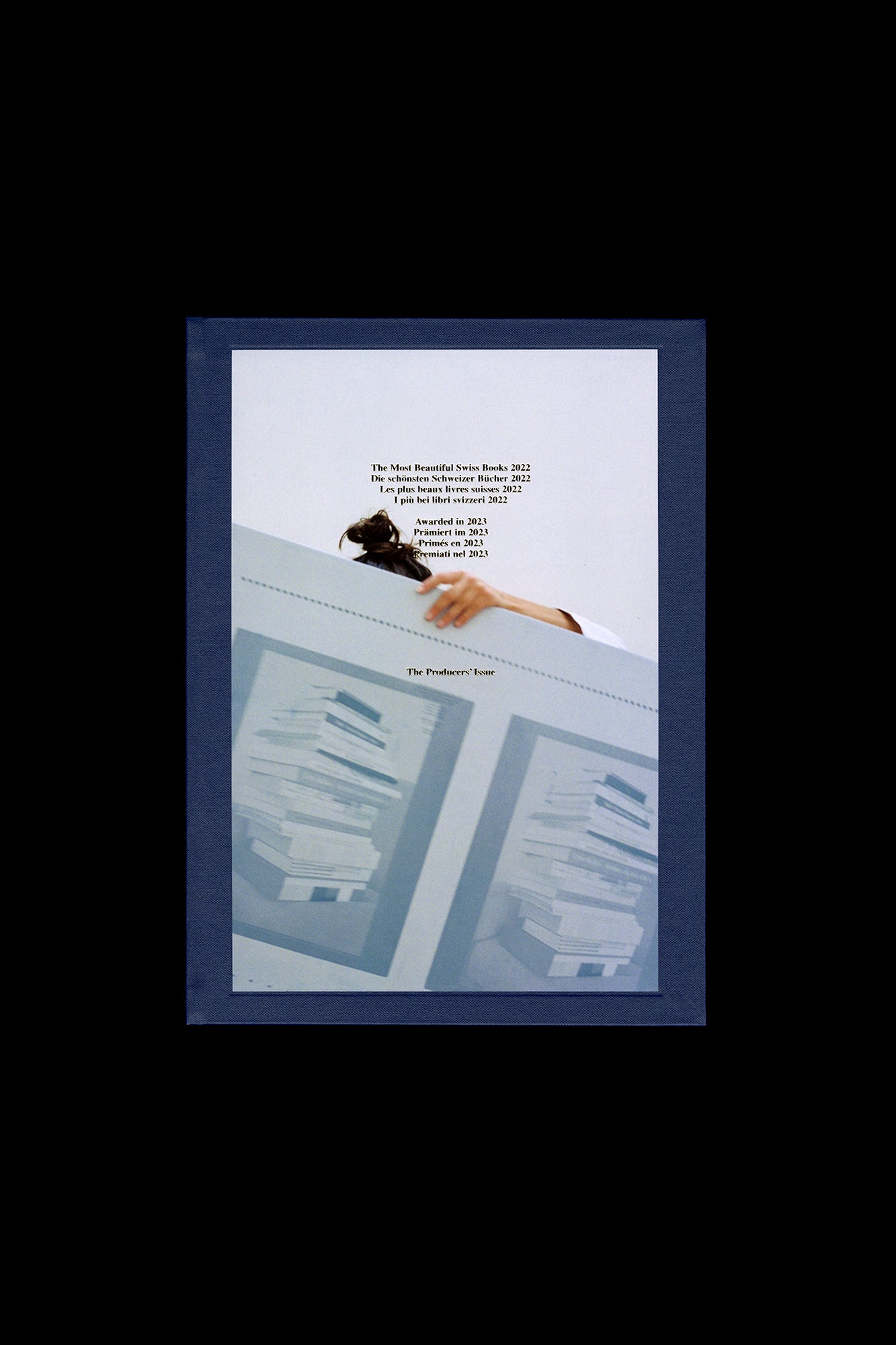
Faire is a bi-monthly publication dedicated to graphic design. Produced by Empire, the publishing arm of French design studio Syndicat (designers Sacha Léopold and François Havegeer), Faire is aimed at students as well as researchers and professional designers. Each issue addresses a specific object or theme and is written by a renowned author. This anthology set includes four issues, numbers 31 through 34: N° 31 — An Edition: The Serving Library. Interview with Stuart Bertolotti-Bailey by James Langdon Dot Dot Dot magazine has always antagonized factions of the graphic design community. While it was definitely just a magazine about graphic design, Dot Dot Dot admitted that graphic design was itself *about* — or at least inseparable from — whatever content it might be used to express. With that innocent assertion, it became, without necessarily trying, a magazine about the potential subject matters of graphic design. A magazine about anything and everything, then! The final Dot Dot Dot was published in 2010. Its successor publication, Bulletins of The Serving Library , has continued its expanded editorial purview. In the course of these 20 years of publishing, its editors have amassed a significant collection of almost 100 objects that have appeared in the magazines. The collection’s contents are by nature various, in format and intent: from images produced to commission for articles, to artworks representing particular histories, positions, and significant practitioners. In autumn of 2020 this collection relocated to an annex of the artist-run space 019 in Ghent, with the prospect of a long-term home there as a teaching space rich with connective threads leading in and out of the recent history and practice of graphic design. N° 32 — A Graphic Designer and Illustrator: Bráulio Amado. By Manon Bruet Writing about a person that one has never met is somewhat like conducting an investigation. The preparation involves collecting words (theirs, those of others), images, sometimes sounds; all clues that allow us to make projections and to formulate theories. In short, it is to attempt to understand and reconstitute a personality, a practice, and ultimately a territory, over time. My investigation into Bráulio Amado began last January when I bought his book 2018 from the site of the Portuguese publisher Stolen Books. I then pursued my inquiry over a number of months, during which I found myself transported in turn from the underground basements of clubs and the Lisbon or New York music scenes, to the columns of an American weekly business magazine, finally ending up at the heart of a certain relationship between the historical poster designer and the very topical graphic designer-illustrator. N° 33 — Ligneous, tentacular forms: Man-eating plants and decorative invasions. By Camille Pageard A new literary genre emerged in 19th century England. The gothic novel appropriated themes that would nourish modern Western cultural productions. Evil spirits, repugnant bodies, exaggerated emotions and a deranged Nature became the protagonists of extra-rational representations. A sub-genre developed within this new trend, where hostile vegetation killed and devoured people with its tentacular vines and roots, poisoned scents and thorny maws. The literary taste for horror led to a new “pleasure of the eye” deployed by illustrators on panels and on the covers of books. This invasion of images in the 19th century was also the invasion of a hybrid Nature, much less tame and regulated than the history of the ornament might suggest. N° 34 — An award: What is a most beautiful book? By Thierry Chancogne It was during the century of Enlightenment that aesthetics became autonomous, that the Beautiful separated itself from the Good and the Useful, like a form of free access to meaning, to truth. And one might well ask if, beginning with the Industrial Revolution, design, from dessin to dessein , has not to some extent taken up the torch of the applied techniques of the former regime of the art of doing and making, and of beauty. What has become of the term “beautiful” as applied to typography, understood as the art of shaping books, since 1943 and the establishment of the “Most Beautiful Swiss Books” award under the influence of the famous Jan Tschichold? Published by Editions Empire Bilingual, in French and English 88 pages total, each issue separately bound, b&w and color images, 8.25 × 11.75 inches ISBN: 979-1-09-599119-9
Publisher
Editions Empire
ISBN-13
9791095991199
Subjects
- Have:1
- Want:—
- Avg Rating:—
- Ratings:—
Community Notes