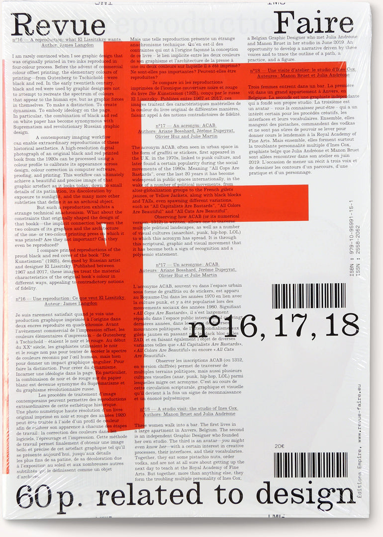
Revue Faire — no. 16, 17, 18
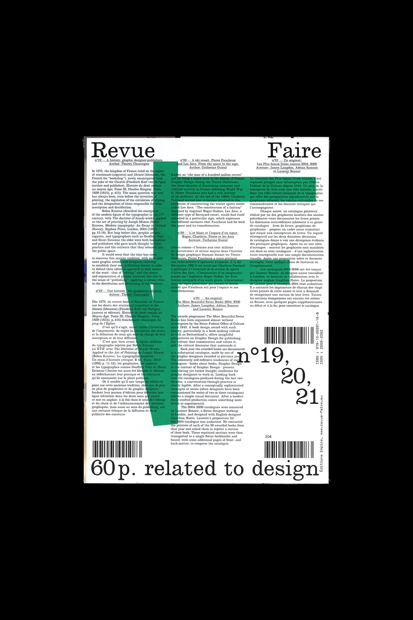
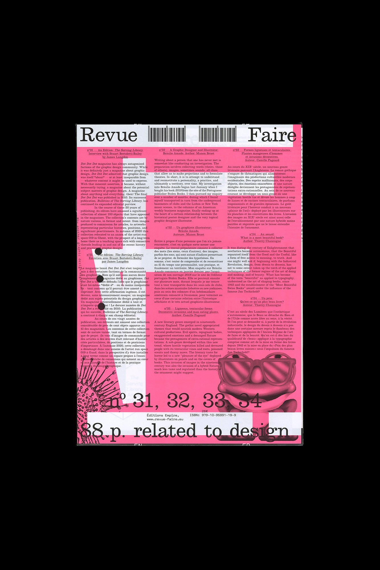
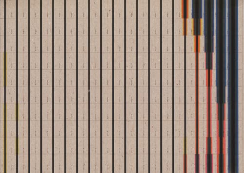
Faire is a bi-monthly publication dedicated to graphic design. Produced by Empire, the publishing arm of French design studio Syndicat (designers Sacha Léopold and François Havegeer), Faire is aimed at students as well as researchers and professional designers. Each issue addresses a specific object or theme and is written by a renowned author. This anthology set includes three issues, numbers 16 through 18: n°16 — A reproduction: what El Lissitzkzy wants. By James Langdon I am rarely convinced when I see graphic design that was originally printed in two inks reproduced in four-color process. Before the advent of commercial color offset printing, the elementary colors of printing — from Gutenberg to Tschichold—were black and red. In the early twentieth century, black and red were used by graphic designers not to attempt to recreate the spectrum of colors that appear to the human eye, but as graphic forces in themselves. To make a distinction. To create dynamism. To embody ideology on the page. In particular, the combination of black and red on white paper has become synonymous with Suprematism and revolutionary Russian graphic design. A contemporary imaging workflow can enable extraordinary reproductions of these historical aesthetics. A high-resolution digital photograph of an original black and red printed book from the 1920s can be processed using a color profile to calibrate its appearance across design, color correction in computer software, proofing, and printing. This workflow can ultimately achieve a beautiful and precise image of that graphic artifact as it looks today, down to small details of its patination, its discoloration by exposure to sunlight, and the many more other subtleties that define it as an archival object. But such a reproduction exhibits a strange technical anachronism. What about the constraints that originally shaped the design of that book — the implicit connection between the two colors of its graphics and the architecture of the one- or two-color printing press on which it was printed? Are they not important? Can they even be reproduced? I compare printed reproductions of the proud black and red cover of the book ‘Die Kunstismen’ (1925), designed by Russian artist and designer El Lissitzky. Published between 1967 and 2017, these images treat the material characteristics of the original book’s color in different ways, appealing to contradictory notions of fidelity. n°17 — An acronym: ACAB. By Ariane Bosshard, Jérôme Dupeyrat, Olivier Huz and Julie Martin The acronym ACAB, often seen in urban space in the form of graffiti or stickers, first appeared in the U.K. in the 1970s, linked to punk culture, and later found a certain popularity during the social movements of the 1980s. Meaning “All Cops Are Bastards”, over the last 20 years it has become widespread in public spaces internationally, in the wake of a number of political movements, from alter-globalization groups to the French gilets jaunes , or Yellow Jackets, along with black blocks and TAZs, even spawning different variations, such as “All Capitalists Are Bastards”, “All Colors Are Beautiful” and “All Cats Are Beautiful”. Observing how ACAB (or its numerical version, 1312) is written, allows one to traverse multiple political landscapes, as well as a number of visual cultures (anarchist, punk, hip-hop, LOL) to which this acronym has spread. It is through this scriptural, graphic, and visual movement that it has become both a sign of recognition and a polysemic statement. n°18 — A studio visit: the studio of Ines Cox. By Manon Bruet and Julia Andréone Three women walk into a bar. The first lives in a large apartment in Anvers, Belgium. The second is an independent Graphic Designer who founded her own studio. The third is an avatar— you might even know her—with a certain interest in creative processes, their interfaces, and their vocabularies. Together, they eat some pistachio nuts, order vodka, and are not at all sure about getting up the next day to teach at the Royal Academy of Fine Arts. But together, more than anything else, they form the troubling multiple personalities of Ines Cox, a Belgian Graphic Designer who met Julia Andréone and Manon Bruet in her studio in June 2019. This publication develops a narrative driven by three voices and traces the outline of a path, a practice, and a figure. Published by Editions Empire Bilingual, in French and English 60 pages total, each issue separately bound, b&w and color images, 8.25 × 11.75 inches ISBN: 979-1-09-599115-1
Publisher
Curated
ISBN-13
9791095991151
Subjects
- Have:1
- Want:—
- Avg Rating:—
- Ratings:—







Community Notes